# Arsenijs Fabrica — Style Reference
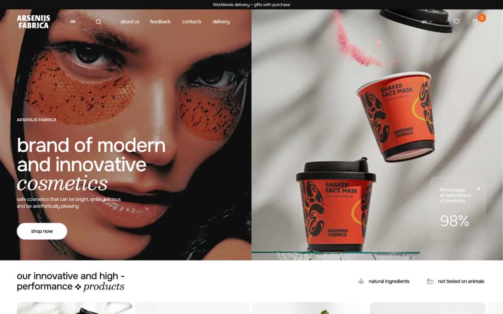
> Editorial beauty spread under gallery lights. Pure-white gallery walls, a single warm strobe pulsing orange against the monochrome, type set thin as glass and hung with generous negative space.

**Theme:** light

Source measurements are normalized; roles and recommendations are interpreted. Font summary lists are independent, not paired by position. HTML examples are reconstructions, not source components.

Arsenijs Fabrica operates as an editorial beauty spread: expansive white surfaces, whisper-weight display type that floats across the canvas, and a single vivid orange that cuts through monochrome like a studio strobe. The brand voice in type is restrained and continental — weights 200-300 at hero scale, near-black text on pure white, generous breathing room between sections. Orange appears as functional punctuation: filled CTAs, modal backgrounds, card borders, and link accents — never as a wash or gradient field. Components feel fashion-magazine lightweight: hairline 1px borders, 10px card corners, 600px pill buttons, and a deliberate absence of shadows across the structural layer.