# mishmash® — Style Reference
> paper boutique, black frame, vivid contents.

**Theme:** light

Source measurements are normalized; roles and recommendations are interpreted. Font summary lists are independent, not paired by position. HTML examples are reconstructions, not source components.

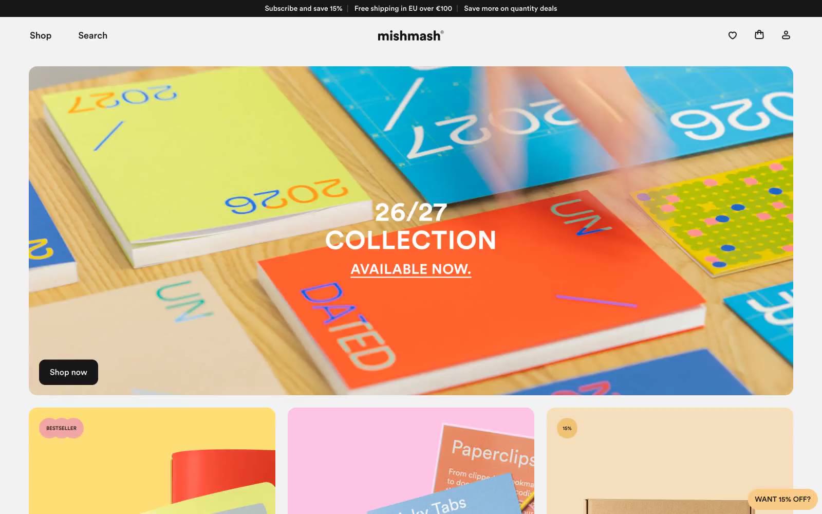
mishmash® operates as a paper goods gallery: the chrome (type, borders, buttons, cards) is almost entirely achromatic, letting the saturated product photography carry every color moment. The layout is a compact, image-led grid where large editorial photos do the heavy lifting and UI elements stay quiet, small, and confident. Only two chromatic tokens exist in the interface — a soft butter yellow and a warmer amber — and both appear as small floating punctuation (sale badges, the persistent discount chip) rather than as filled buttons or backgrounds. Type is the only place warmth enters the system: Circular at modest sizes with comfortable line-height, set tight to the grid. The result feels like a curated stationery boutique — restrained shell, vivid contents.