# Egstad — Style Reference
> editorial broadside in warm ink — monumental type, one paper color, zero decoration

**Theme:** light

Source measurements are normalized; roles and recommendations are interpreted. Font summary lists are independent, not paired by position. HTML examples are reconstructions, not source components.

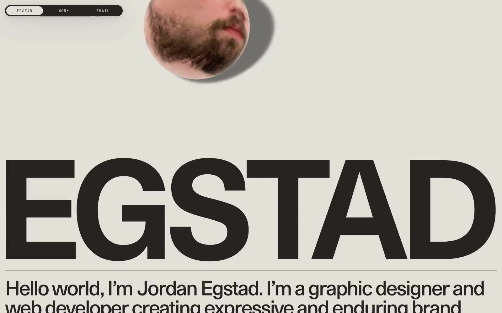
Egstad operates as a one-color editorial broadside: warm ink (#252422) stamped onto warm cream paper (#e2e0d9), with no decorative color, no gradients, and almost no UI chrome. The entire visual identity is carried by three typefaces — a custom monumental display face (EG Metaphor) that fills the page edge-to-edge, system Times for body copy, and a wide-tracked micro-display (S85) for navigation. Components are stripped to their bones: a fully pill-shaped dark navigation bar, hairline horizontal rules, and circular image masks that overlap type without containers. The result reads more like a printed poster or magazine masthead than a typical portfolio site — restraint as identity, typography as architecture.