# AI for Business — Style Reference
> Brutalist editorial showroom on warm gray

**Theme:** light

Source measurements are normalized; roles and recommendations are interpreted. Font summary lists are independent, not paired by position. HTML examples are reconstructions, not source components.

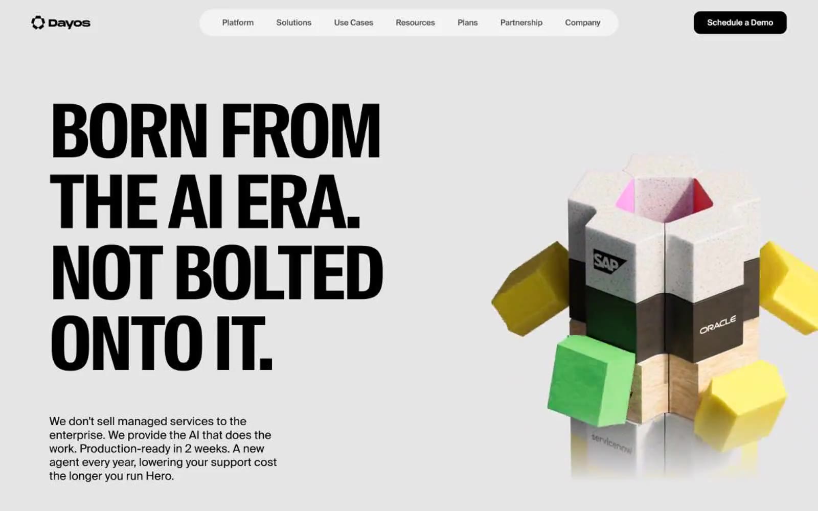
Dayos runs on a brutalist-editorial logic: near-monochrome canvas (#e5e5e5 page, #ffffff cards, #000000 blocks), oversized uppercase display type squeezed into 0.9 line-height, and zero shadows or gradients. The single chromatic accent is a pale mint green (#d1ffca) used sparingly on tags and links, with yellow (#fff100) as a near-neon highlight on small elements. Components are heavy on border-radius (24-64px on cards, 48px on nav pills) and light on decoration — flat surfaces, thin or zero borders, no elevation effects. Typography does all the emotional work: compressed condensed headlines at 130px tower over 16px body text, creating a dramatic scale ratio. The hero pairs a massive black headline with a 3D physical object render (textured cubes with brand labels), establishing a tactile, material-product feel against the clinical canvas.