# Fiasco — Style Reference
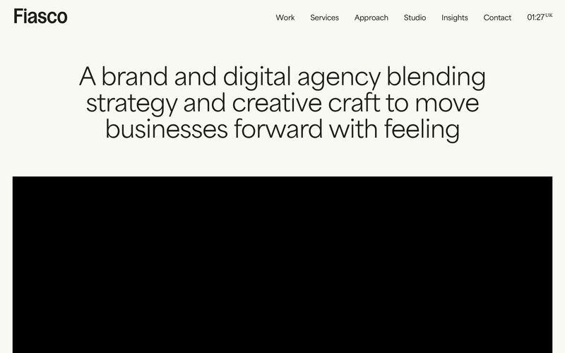
> "editorial gallery on cream paper" — warm off-white canvas with confident black type and single-color project cards.

**Theme:** light

Source measurements are normalized; roles and recommendations are interpreted. Font summary lists are independent, not paired by position. HTML examples are reconstructions, not source components.

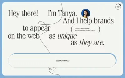
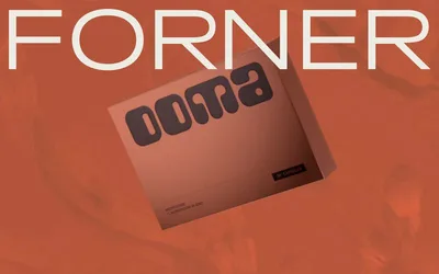
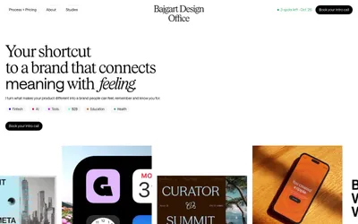
Fiasco operates in an editorial, gallery-like register: a warm off-white canvas (#f8f9f3) with near-black text (#1d1e19) creates a hushed paper feel, while every project card introduces a single vivid color field that acts as wayfinding rather than decoration. The type system pairs a geometric sans (area-normal) for body and interface with a more characterful display family (Gooper) for headlines, giving the page an italic, magazine-like confidence. Components are deliberately unembellished — pill-shaped buttons (800px radius), 8px-cornered cards, 3px input fields, and a 40px radius reserved for hero and feature surfaces. Color appears as sparse, deliberate punctuation: yellow, pink, blue, orange, green blocks behind work, while the rest of the system stays in warm neutrals so the colored surfaces read as the loudest thing in the room.