# ClickUp™ — Style Reference
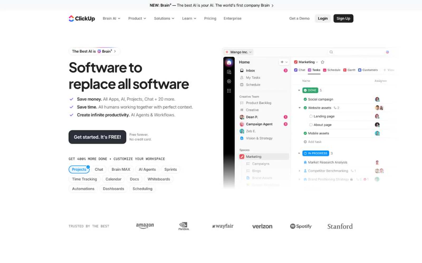
> Hardworking dashboard on white marble. The page is a product brochure for a productivity tool, so the visual language borrows from the product itself: dense lists, status pills, avatar clusters, and bold typographic claims that read like a product spec sheet at exhibition scale.

**Theme:** light

Source measurements are normalized; roles and recommendations are interpreted. Font summary lists are independent, not paired by position. HTML examples are reconstructions, not source components.

ClickUp speaks in a sharp, high-contrast productivity dialect: a white canvas where oversized bold headlines (52-80px, weight 650-800, tracking pulled to -0.04em) collide with compact 14px button labels and a black filled CTA. The signature move is the 9999px pill — chips, tags, nav items, and badges all share one relentless full-radius curve, giving the interface a soft, rounded personality against otherwise hard typographic weight. Color is used surgically: a single vivid purple (#6647f0) stamps brand identity, blue (#0091ff) handles interactive links, and the rest of the system is pure grayscale. Rotating conic-gradient borders animate around hero elements, the only moment the page lets its hair down. The product UI screenshot on the right of the hero anchors the brand: real, dense, working software — not abstract gradients or stock illustration.