# Glossier — Style Reference
> Sunlit beauty editorial — paper white, ink black, one flash of yellow

**Theme:** light

Source measurements are normalized; roles and recommendations are interpreted. Font summary lists are independent, not paired by position. HTML examples are reconstructions, not source components.

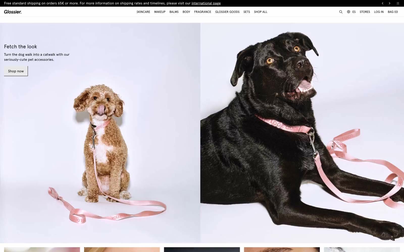
Glossier operates as a digital beauty magazine: a near-monochrome canvas of paper-white and ink-black, disrupted by one electric yellow accent that functions as both the brand wordmark and the singular call to action. The system is editorial in restraint — huge Apercu headlines, generous breathing room, full-bleed lifestyle photography that carries most of the emotional weight — and utilitarian in execution, with flat product cards, hairline borders, and zero decorative ornament. The yellow is not a secondary brand color; it IS the brand, deployed sparingly so each appearance feels like a flashbulb. Everything else must recede: neutrals are warm grays with a faint blush undertone, borders are barely-there, type is tight and compressed. The result is a storefront that reads as confident, understated, and unapologetically modern.