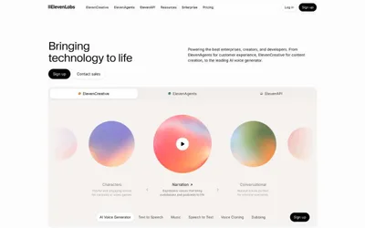
# Cohere — Style Reference
> Editorial monograph on cream paper — every screen is a spread, not a dashboard.

**Theme:** light

Source measurements are normalized; roles and recommendations are interpreted. Font summary lists are independent, not paired by position. HTML examples are reconstructions, not source components.

Cohere reads as an editorial product monograph: a cream-white canvas, near-black typography, and pill-shaped dark CTAs carry the entire hierarchy without ornament. The signature is restraint — one tri-color gradient (coral → violet → blue) appears only inside photography and decorative washes, never on UI controls, so the interface stays monochrome while imagery supplies chromatic warmth. Typography does the heavy lifting: Unica77 at every UI role with tight negative tracking, and a wider CohereText display face for hero headlines, creating editorial authority rather than SaaS density. Components are minimal and confident — 22px rounded image cards, hairline #e5e7eb borders, dark filled actions — letting photography, code snippets, and copy carry the narrative weight.