# Ada — Style Reference
> Daylight gallery with pastel punctuation — a quiet off-white room where four jewel-tone colors are allowed to speak, and everything else stays in charcoal.

**Theme:** light

Source measurements are normalized; roles and recommendations are interpreted. Font summary lists are independent, not paired by position. HTML examples are reconstructions, not source components.

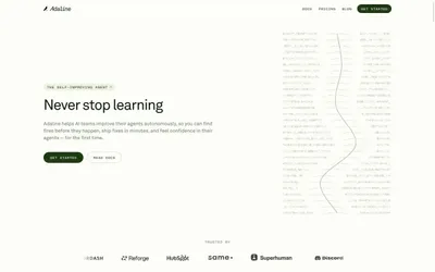
Ada operates as a daylight gallery: an off-white canvas with generous breathing room, a single humanist sans-serif doing all the voice work, and jewel-toned accent colors that appear only as deliberate punctuation marks. The visual system resists decoration — no gradients on buttons, no drop shadows on cards, no chrome competing with content. Instead, identity comes from a small, disciplined palette (forest green, periwinkle blue, candy pink, butter yellow) used as left-edge accent bars on stat cards and as filled pill buttons. Hierarchy is built through size contrast and whitespace, not color volume. Surfaces sit on a warm #f9f9f9 ground with #ffffff cards floating above. The hero's defining move is a heavily blurred photographic background that feels like looking through frosted glass — it adds warmth and depth without competing with the white headline that reads like editorial typography.