# Ambrook — Style Reference
> harvest ledger on butcher paper

**Theme:** light

Source measurements are normalized; roles and recommendations are interpreted. Font summary lists are independent, not paired by position. HTML examples are reconstructions, not source components.

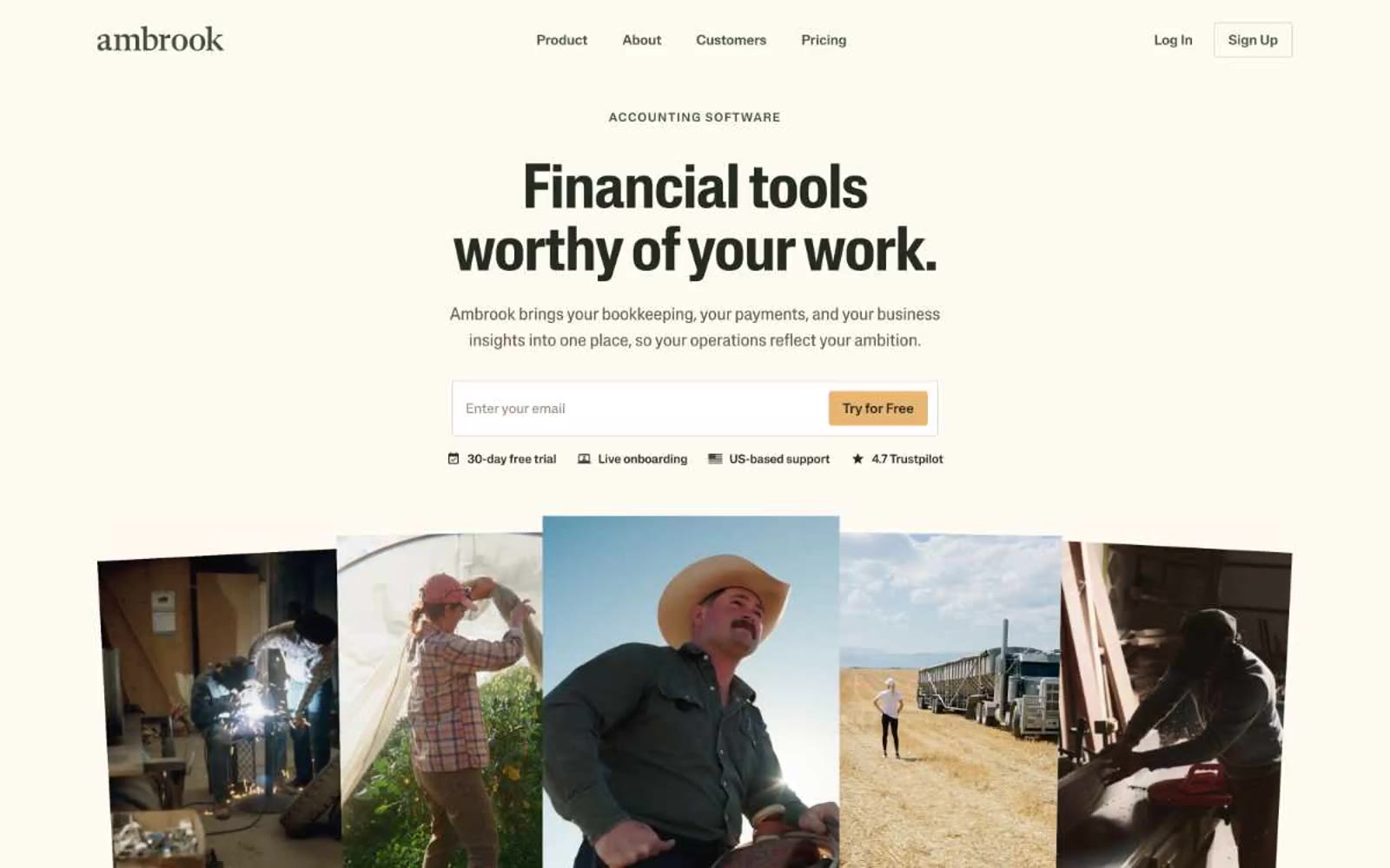
Ambrook speaks in the visual dialect of American heartland: warm parchment canvas, ink-dark type, and a single harvest-amber accent that warms every primary action. The palette is deliberately desaturated — olive greens, wheat tans, bark browns — as if the interface itself were printed on recycled butcher paper and stamped with soy ink. Headlines use a custom display face with quiet authority (weight 500, not the expected 700), and every section opens with a small uppercase eyebrow that breathes across the page on wide tracking. Photography is documentary, not aspirational — welders, ranchers, truckers, unposed and full-sun. The result is an interface that feels rooted, not glossy: trustworthy through warmth rather than through chrome.