# Filling Pieces — Style Reference
> monochrome fashion editorial

**Theme:** light

Source measurements are normalized; roles and recommendations are interpreted. Font summary lists are independent, not paired by position. HTML examples are reconstructions, not source components.

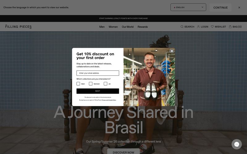
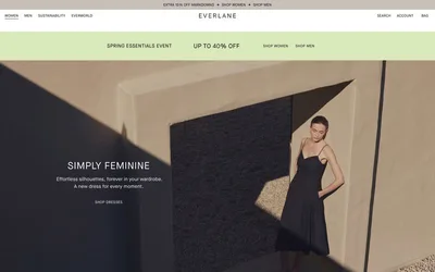
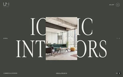
Filling Pieces operates as a monochrome fashion editorial: the entire interface is grayscale, so the brand voice lives in photography and type, not color. A single custom sans-serif (favorit, weights 400/600) carries every label, headline, and product name, with a fixed -0.04em tracking that compresses every glyph into a tight editorial lockup. The 100px display weight is the hero's only punctuation — it is enormous, sitting directly over full-bleed photography with no overlay card or gradient. Surfaces stay warm and flat: hairline #e5e7eb borders at 1px, no shadows, no gradients, an 8px radius applied uniformly to inputs and buttons. Product cards are flat on a warm-gray canvas; the grid reads like a magazine spread, not a typical ecommerce tile wall. Every element earns its presence by being quiet.