# Resident — Style Reference
> Architecture monograph on cream paper

**Theme:** light

Source measurements are normalized; roles and recommendations are interpreted. Font summary lists are independent, not paired by position. HTML examples are reconstructions, not source components.

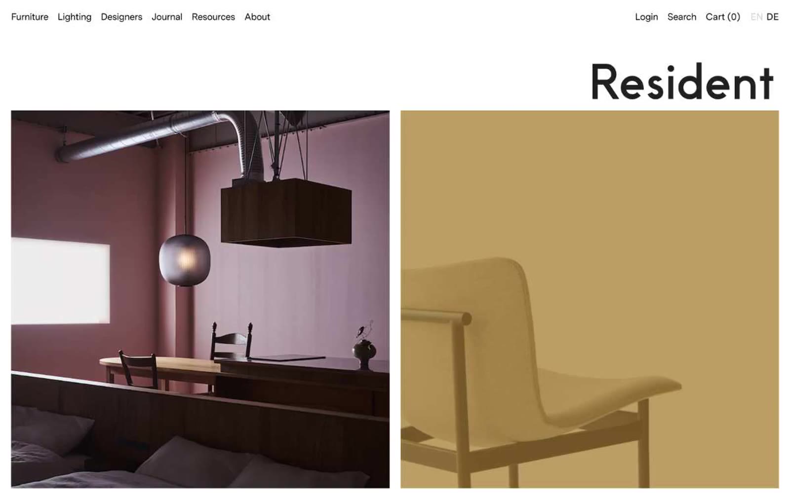
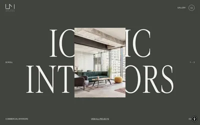
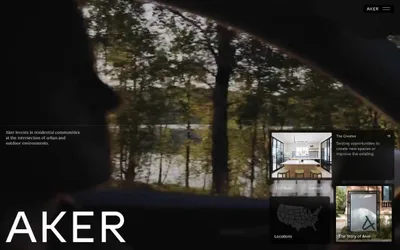
Resident operates as a quiet editorial gallery for design objects: white paper canvas, near-zero chrome, and large-format photography doing all the visual work. The interface is almost entirely monochrome — black ink on white paper with hairline rules and small ghost text — letting the rooms, furniture, and light fixtures themselves provide every chromatic decision. Typography is a single custom sans-serif (MessinaSans) at moderate weights with tightened tracking, giving headlines a precise, catalogue-like authority without ever feeling loud. Components are reduced to their skeletons: a tiny underlined nav, border-only buttons, a section heading that scales to the edge of the column. No shadows, no gradients, no surface elevation — depth comes only from the photographs and generous vertical breathing room between editorial spreads.