# Airtable — Style Reference
> warm workshop with color-coded chapters

**Theme:** light

Source measurements are normalized; roles and recommendations are interpreted. Font summary lists are independent, not paired by position. HTML examples are reconstructions, not source components.

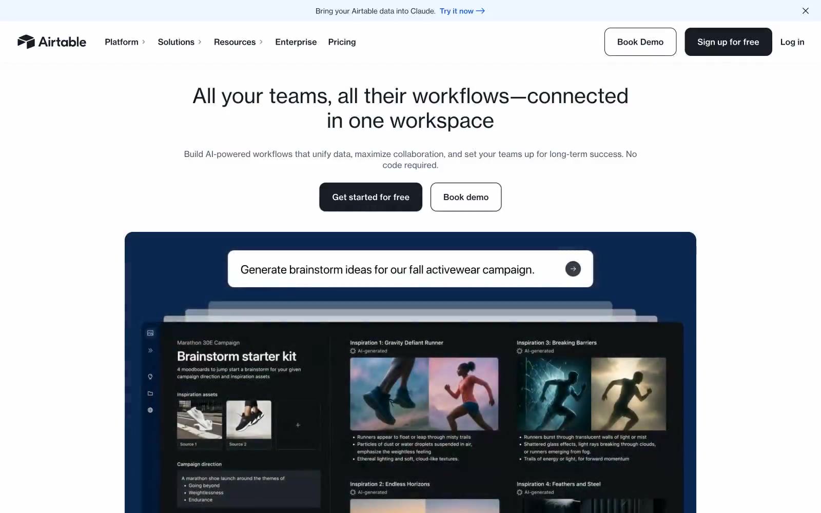
Airtable presents as a warm, editorial workspace rather than a cold SaaS dashboard. The canvas is a soft cream parchment (#faf5e8) — never stark white — which gives the whole site a paper-like, almost printed feel. Typography is bold and unapologetic: a custom display face at near-900 weight for hero headlines pairs with a workhorse sans for body and UI. Buttons are pure black, not the expected brand-blue, giving the page an architectural, almost print-publication confidence. The signature move is color-coded feature cards — each use case gets its own saturated hue (terracotta, deep blue, forest green, peach, pink) functioning as chapter dividers in a visual catalog. The overall effect is a creative studio notebook: warm, organized, opinionated, and human.