# NCDA — Style Reference
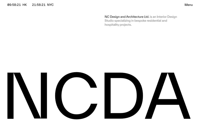
> Architectural monograph in negative space. The NCDA wordmark at 62px is cropped by the viewport edge, turning a logo into a wall.

**Theme:** mixed

Source measurements are normalized; roles and recommendations are interpreted. Font summary lists are independent, not paired by position. HTML examples are reconstructions, not source components.

NCDA operates as a printed monograph translated to the web: paper-white canvas, a single near-black ink, zero chromatic noise, and type that does the structural work that color usually does. The signature move is the wordmark itself — rendered at architectural scale and cropped by the viewport edge, it turns the brand mark into a layout device rather than a logo. Navigation is reduced to essentials: a live dual-city clock in the corner, a single 'Menu' trigger, and a tight gray description block. The system alternates between vast white negative space and occasional full-bleed black bands, creating an exhibition-catalogue rhythm. Components are sparse and unornamented — no shadows, no rounded corners, no buttons — just hairline rules, generous margins, and type that whispers through tight negative tracking at display sizes and slightly positive tracking at caption sizes.