# Analogue — Style Reference
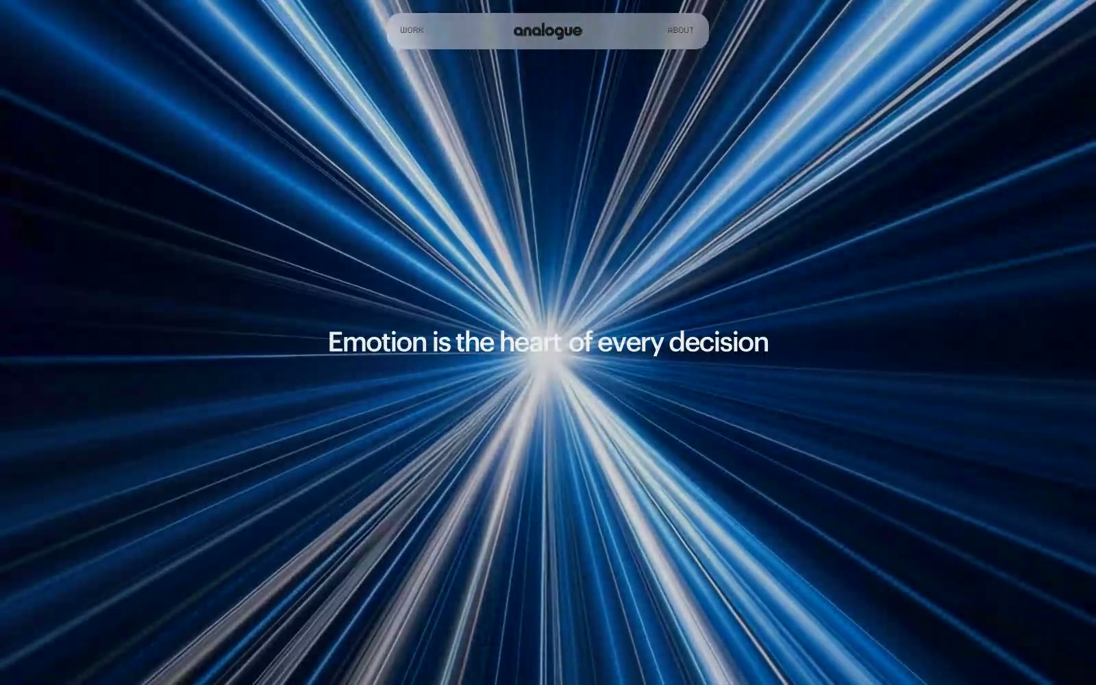
> Light tunnel through void

**Theme:** dark

Source measurements are normalized; roles and recommendations are interpreted. Font summary lists are independent, not paired by position. HTML examples are reconstructions, not source components.

Analogue operates as a cinematic void with a single luminous focal point: white type against near-black depth, interrupted only by a blue-white photographic light burst. The system is strictly achromatic — no chromatic accents, no shadows, no decorative gradients — so every emotional beat must come from typography, photography, and negative space. Type sits at a compressed 11–18px body register with whisper-tight tracking (-0.05em at display) and cinematically tight line-heights (1.00–1.05 on 40–60px display), making headlines feel like film titles rather than web headings. The LCD dot font appears as a single rare accent — digital punctuation in an otherwise humanist system. Navigation is a floating translucent pill, buttons are achromatic outlines or ghosts, and the architecture of the page (borders, surfaces, dividers) is so flat it disappears, forcing the photography and the type to do all the work.