# Brand — Style Reference
> Chromatic graph paper atlas — a living brand specimen where every color block, headline, and border snaps to an invisible modular grid printed on white.

**Theme:** light

Source measurements are normalized; roles and recommendations are interpreted. Font summary lists are independent, not paired by position. HTML examples are reconstructions, not source components.

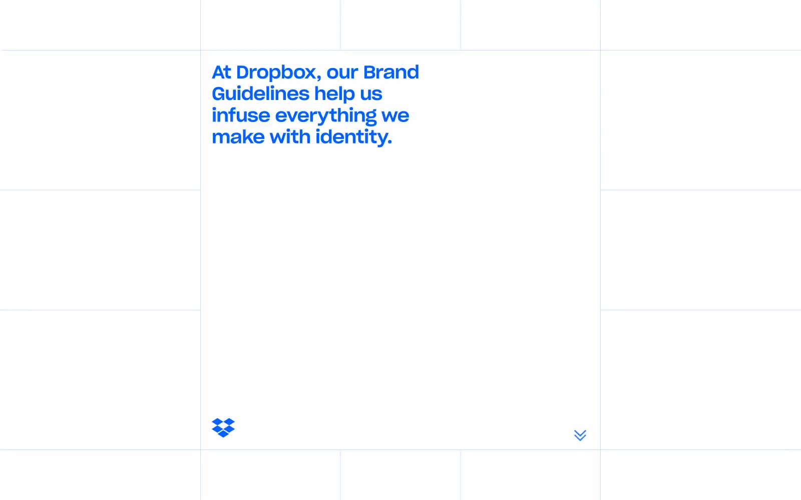
Dropbox Brand Guidelines uses a Swiss-editorial visual system: a white graph-paper canvas with thin gray grid lines that organizes the entire page into discrete cells, each capable of holding either type or a flat color block. Headlines are tight-tracked, heavy sans-serif set in Dropbox Blue (#0061fe) that bleeds into the grid as confident editorial type, while a curated palette of eight vivid swatches — tangerine, sky cyan, sun yellow, lime, coral, lavender, magenta, slate — populates large rectangular panels that act as both color documentation and page furniture. The system feels like a living style guide: the grid IS the layout, color blocks ARE the content, and every element snaps to the modular lattice. The only radius is 8px, the shadows are absent, and the typographic discipline is total.