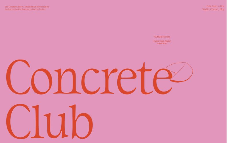
# Concrete Club Studio — Style Reference
> sun-faded editorial zine on dusty rose paper — the layout is a printed page, not a screen

**Theme:** mixed

Source measurements are normalized; roles and recommendations are interpreted. Font summary lists are independent, not paired by position. HTML examples are reconstructions, not source components.

Concrete Club is a warm editorial zine on dusty rose: oversized serif wordmarks dominate generous pink and off-white fields, small uppercase sans-serif tags steer the eye, and single warm orange-red ink bleeds through the layout as the one chromatic accent. Sections alternate between dusty rose, off-white canvas, and deep charcoal — each acts as a separate printed page bound into one publication. Typography is the interface: a distinctive humanist serif (DaVinci) carries all display weight, while Helvetica Neue Light whispers at body and nav scale. Hand-drawn line illustrations interrupt the grid at the right margin of the wordmark, softening the bold typographic authority with lo-fi charm. Everything else is restrained — no buttons, no cards, no shadows — the page behaves like a printed art book, not a software product.