# Home — Style Reference
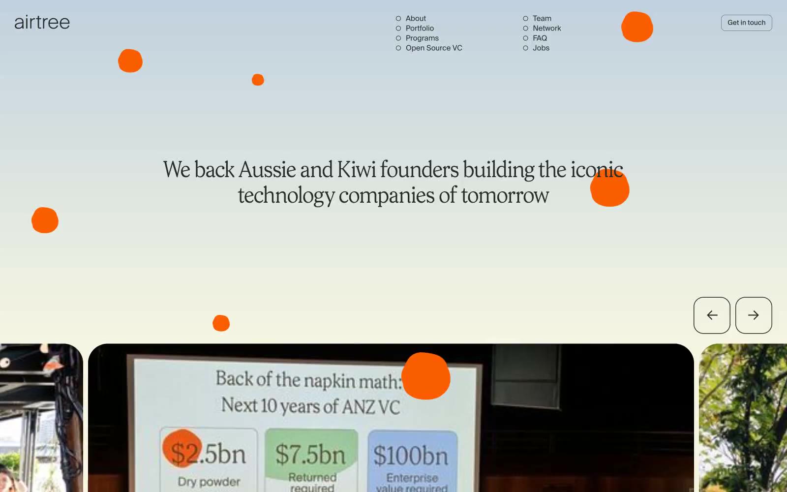
> Sunlit eucalyptus grove on warm parchment — the design rests on a cream page where ink-black type and a single electric yellow accent do all the talking.

**Theme:** light

Source measurements are normalized; roles and recommendations are interpreted. Font summary lists are independent, not paired by position. HTML examples are reconstructions, not source components.

Airtree's design language reads as a sunlit editorial spread on warm parchment: a cream canvas (#f7f6e3) carries confident charcoal type, with a single electric yellow accent that punctuates rather than decorates. Prody's oversized display serif at 131px is the brand's loudest voice — everything else is deliberate whitespace and a clean grotesque. Components stay light and paper-like: 37px-rounded cards, outlined ghost controls, pill-shaped yellow CTAs, and hairline borders that define structure without weight. The system avoids heavy elevation, gradients, or saturated color fields; it relies on generous spacing, large radii, and a calm two-tone palette to let photography and quoted founders carry the emotional weight. Color is rationed: a cream page, ink-black type, and one jolt of yellow — no decorative gradients, no multi-hue branding.