# Playful — Style Reference
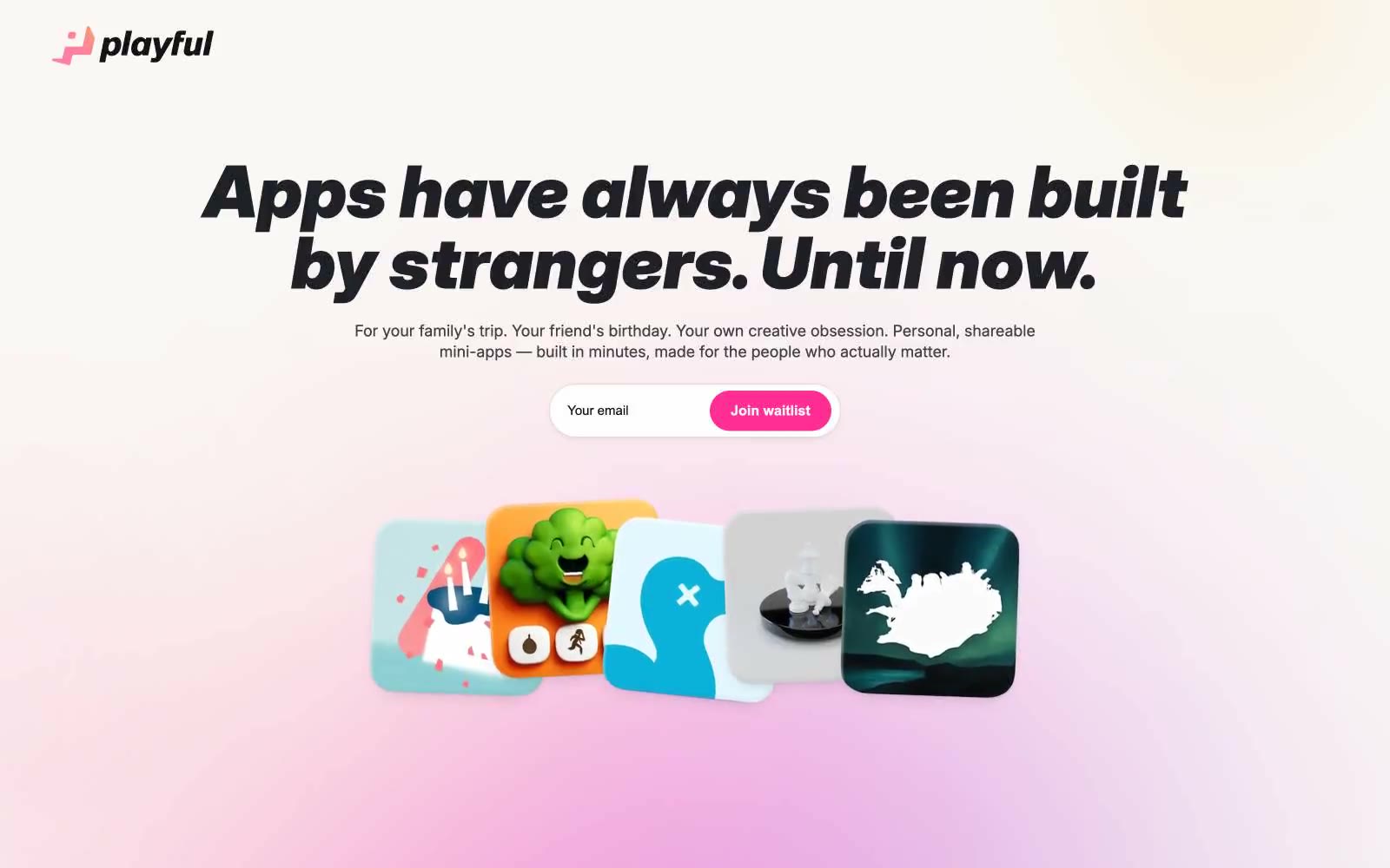
> sunlit paper notebook with a hot-pink highlighter. A friendly, editorial product surface printed on warm cream stock, where one vivid magenta accent punctuates an otherwise monochrome warm-gray world.

**Theme:** light

Source measurements are normalized; roles and recommendations are interpreted. Font summary lists are independent, not paired by position. HTML examples are reconstructions, not source components.

Playful reads like a warm, hand-crafted workshop printed on cream paper. The entire surface sits on a sandy oat canvas (#f6f2ee) rather than clinical white, giving every screen a paper-like, approachable warmth. A single hot-pink (#ff2e95) does all the chromatic work — CTAs, links, logo mark — against a near-black ink (#111/#000), so screens stay visually quiet until a moment of action is needed. The display type is unapologetically heavy and italic at 70–79px, leaning into editorial poster energy rather than SaaS neutrality. Components are large and soft: 44px cards on pill-shaped buttons, deep diffused shadows, generous breathing room. The overall rhythm is one bold typographic statement per section, surrounded by quiet warm whitespace.