# Cassette — Style Reference
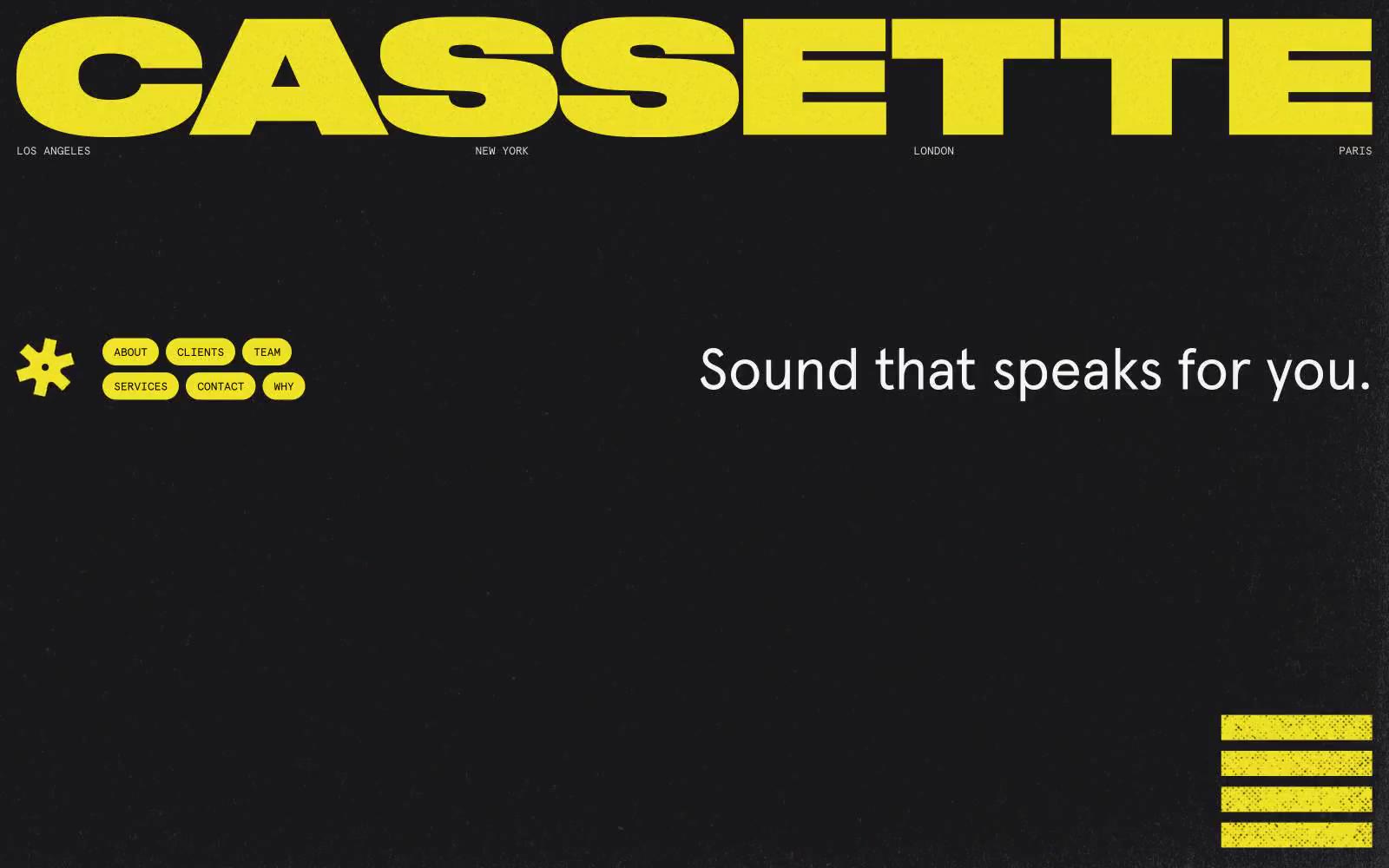
> Neon cassette on black velvet. A single hi-vis yellow burns against a warm-black void, the way a tape label glows under a single bulb in a dark room.

**Theme:** dark

Source measurements are normalized; roles and recommendations are interpreted. Font summary lists are independent, not paired by position. HTML examples are reconstructions, not source components.

Cassette is a music curation agency site that reads like a single-color risograph print: near-black canvas, one electric yellow doing all the work, and a mono/sans typography pair that feels like liner notes and stage signage. The visual system is deliberately austere — no gradients, no shadows, no decorative secondary hues — so the yellow wordmark, pill buttons, and equalizer bars hit with amplifier-level intensity against the dark ground. Layout is editorial and collage-driven: oversized type, asymmetric image stacks, and bordered logo grids. Components are flat, fully rounded (900px pills), and bordered rather than elevated, with a pervasive grain/noise texture that gives even flat color a tactile, photocopied quality.