# Athletics — Style Reference
> monograph on black velvet

**Theme:** dark

Source measurements are normalized; roles and recommendations are interpreted. Font summary lists are independent, not paired by position. HTML examples are reconstructions, not source components.

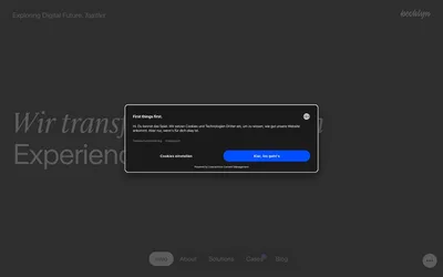
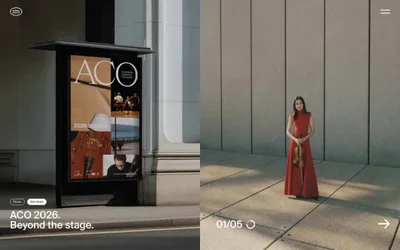
Athletics operates as a gallery-grade creative studio: the entire experience sits on a dark canvas, letting enormous light-weight serif display type breathe against deep charcoal and pure black. The system is ruthlessly monochromatic — zero chromatic color across the interface, with warmth and saturation living exclusively inside editorial photography and the brand mark. Typography does the heavy lifting: a high-contrast pairing of a delicate serif display (Feature Deck at 300 weight, 72–116px) against a quiet grotesque (Söhne at 300/400 for everything functional). The layout is full-bleed, generous, and editorial — wide section gaps of 128–144px, asymmetric two-column blocks, and a vertical service index annotated with A/B/C/D letter labels that evoke a printed specimen sheet. Components are minimal: pill-shaped tags, hairline borders, no shadows, no gradients, no elevation. It reads as confident, restrained, and considered — the design equivalent of a well-typeset monograph.