# Aurora — Style Reference
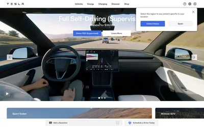
> autonomous horizon at dawn — a clean white cockpit looking out onto a sunlit highway, one electric blue dial on the dashboard.

**Theme:** light

Source measurements are normalized; roles and recommendations are interpreted. Font summary lists are independent, not paired by position. HTML examples are reconstructions, not source components.

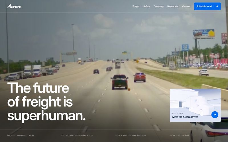
Aurora's interface is an open highway: a white canvas stretching wide, deep navy type that reads like road markings, and a single electric blue accent that signals action like a turn signal. The hero is a full-bleed dashcam perspective with a 90px white headline overlaid — the photography carries the emotional weight, the UI stays out of the way. Below the fold, surfaces shift to cool pale-gray cards, paragraphs reveal themselves word-by-word as the user scrolls, and the signature cyan-to-cobalt gradient is reserved for the moments that should feel like the brand's namesake — rare, vivid, always purposeful. Everything is rectilinear with 8px corners, no shadows, no decorative flourishes; depth comes from layering color and scale, never from elevation.