# Creative Giants — Style Reference
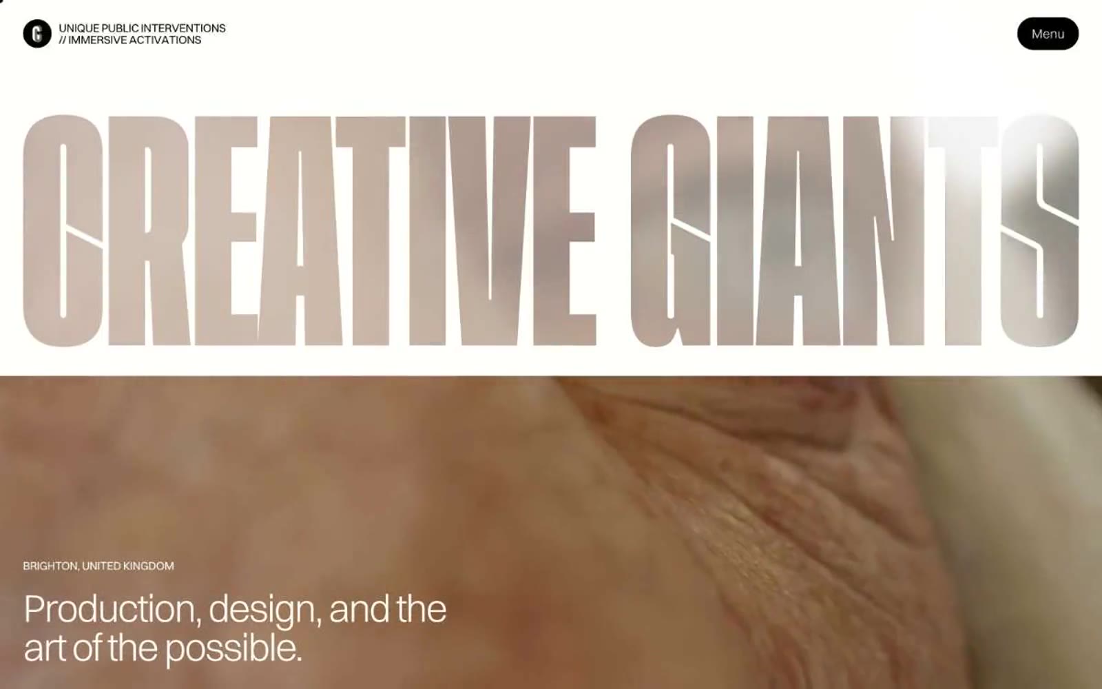
> oversized editorial poster on cream paper

**Theme:** light

Source measurements are normalized; roles and recommendations are interpreted. Font summary lists are independent, not paired by position. HTML examples are reconstructions, not source components.

Creative Giants reads like an oversized art-book spread rendered in code: a warm off-white canvas, hairline margins, and display type so large it functions as a poster rather than a heading. The whole system runs on negative space and one weight of light (300) — headlines whisper at 64–84px instead of bolding into shouting, and letter-spacing tightens aggressively (-0.04em) as type grows so the words feel chiseled, not spaced. Chromatic color is rationed into small, saturated hits: vivid magenta, deep teal, powder blue, hot pink, mint, and navy appear as card surfaces or accents, never as background floods. Interactive elements are black-on-cream pills with fully rounded (1440px) radii, and the chrome is almost invisible — a single circular logo mark and a 'Menu' button floating in white space. The visual identity is a production studio's contact sheet: one enormous headline, one full-bleed photograph, one quiet line of meta text. Every other page should follow the same economy.