# Gsap — Style Reference
> animated chalkboard in a design studio. A near-black wall, warm cream chalk, and five color-coded highlighters — one for each animation discipline.

**Theme:** dark

Source measurements are normalized; roles and recommendations are interpreted. Font summary lists are independent, not paired by position. HTML examples are reconstructions, not source components.

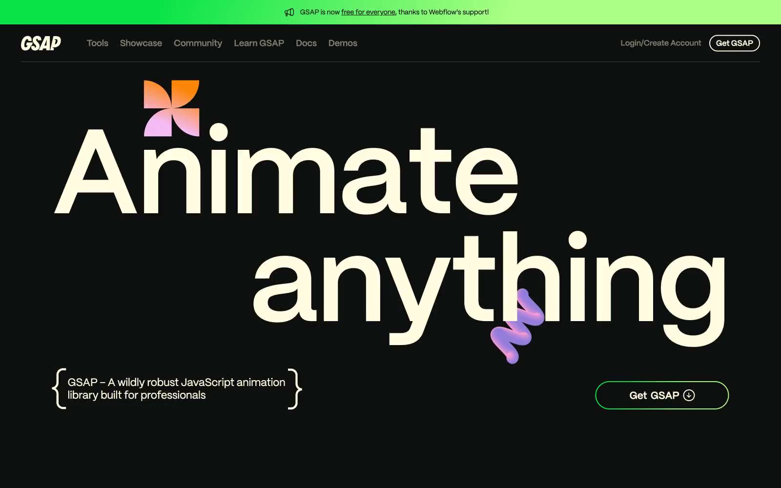
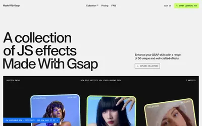
GSAP is a dark-canvas design language built for a motion library: a near-black stage where massive cream type, thin outlined pill buttons, and individually color-coded category labels create a typographic showcase rather than a traditional marketing site. The system runs on a single warm cream surface color (#fffce1) against an almost-black background, with category words each wearing their own vivid hue (green for the brand mark, orange for SVG, pink for Scroll, violet for Text, blue for UI) — color functions as taxonomy, not decoration. Typography is the hero: a single sans-serif (Mori) at six weights, pushing to 224px for the main headline with aggressive negative tracking and near-1.0 line-height, so words feel carved rather than laid out. Buttons are almost exclusively ghost-pills with 100px radius and hairline cream borders; there are no filled CTAs, which lets the gradient hero flourish and keeps every interactive element weightless.