# Made With Gsap — Style Reference
> editorial ink on warm concrete

**Theme:** light

Source measurements are normalized; roles and recommendations are interpreted. Font summary lists are independent, not paired by position. HTML examples are reconstructions, not source components.

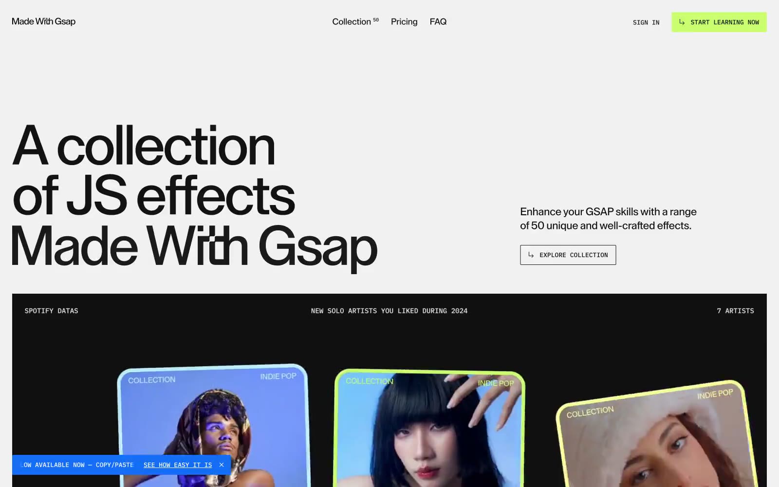
Made With Gsap is a high-contrast editorial showcase built on a near-monochrome canvas: warm light-gray surfaces against ink-black type at near-architectural scale. A single vivid lime accent (#c9fe6e) acts as the only chromatic note, used sparingly for CTA fills, active borders, and hover states. The visual system is typographically driven — display headlines reach 100-250px with aggressively tight tracking and line-heights under 0.90, letting the words themselves become composition. Cards, dividers, and frames keep radii at 2-12px (nearly sharp), and the page alternates between the light canvas and full-bleed dark demo cards that invert the palette. Everything else is restraint: thin borders, compact spacing, no shadows, no gradients, and one custom geometric grotesk doing all the work.