# 12th Berlin Biennale for Contemporary Art — Style Reference
> Iris-and-ink broadsheet — violet skies over monumental black type on white paper.

**Theme:** light

Source measurements are normalized; roles and recommendations are interpreted. Font summary lists are independent, not paired by position. HTML examples are reconstructions, not source components.

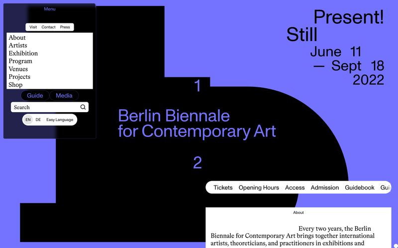
The 12th Berlin Biennale reads as an iris-and-ink broadsheet: white paper canvas, monumental black geometric forms, and a single saturated violet (#7373ff) that functions as sky, border, and accent simultaneously. The system is editorial and constructivist — overlapping rectangular shapes at display scale carry the brand, while a geometric grotesque (ABCMonumentGrotesk) pairs with a transitional serif (BradfordLL) to create a high-contrast, catalog-like rhythm. Interactions are tight and rectilinear: 3px corners, 4px base spacing, hairline black or violet borders, and almost no shadow or gradient — visual weight comes from type size and color, not elevation. The page is text- and information-dense rather than spacious, with compact nav, overlapping panels, and event cards stacked close together like a biennale program leaflet.