# V–A–C — Style Reference
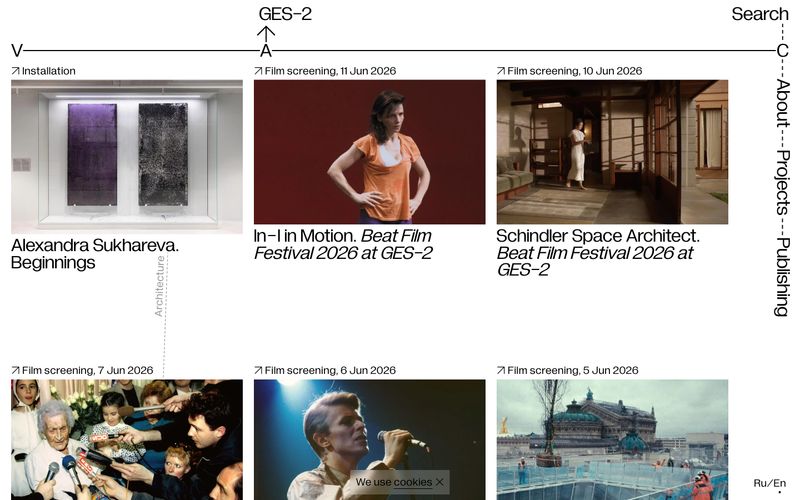
> Gallery wall on a drafting table. The starkness of a printed exhibition catalog where every margin, weight, and registration mark is deliberate.

**Theme:** light

Source measurements are normalized; roles and recommendations are interpreted. Font summary lists are independent, not paired by position. HTML examples are reconstructions, not source components.

V–A–C reads like a printed exhibition catalog translated to the web: pure white paper, pure black ink, and not a single chromatic pixel. The entire system is achromatic — typography does all the expressive work, and it does so at a single weight (400) across both body and display. The signature is the V—A—C registration line stretching full-bleed across the top of every screen, turning the page header into an architectural measurement mark. Layout is a strict three-column card grid where each card is a museum wall label: full-bleed image, tiny ↗ metadata link, and a tight two-line title — separated by 250px+ of vertical breathing room between rows. No shadows, no rounded corners, no gradients, no accent color. The visual language is the visual restraint.