# Peloton — Style Reference
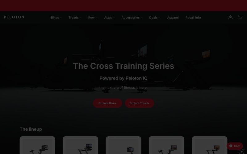
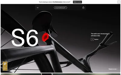
> Red beacon on charcoal runway. A fitness showroom where one electric red CTA cuts through vast dark exhibition space into clean white product galleries.

**Theme:** mixed

Source measurements are normalized; roles and recommendations are interpreted. Font summary lists are independent, not paired by position. HTML examples are reconstructions, not source components.

Peloton runs a disciplined two-mode visual system: cinematic charcoal hero surfaces that make product photography glow, followed by bright white product grids that let the merchandise speak. The palette is almost entirely achromatic — gunmetal, white, and warm grays — with one vivid red accent that acts as the only chromatic punctuation on the page, reserved exclusively for primary actions, brand marks, and the persistent chat widget. Inter carries the entire typographic voice at a wide range of weights, from whisper-light 300 display headlines to confident 500 nav labels, creating a calm, premium fitness-retail atmosphere. Components are generous: 28px pill buttons, 6px inputs, 24px image corners, and minimal elevation — surfaces do the structural work, shadows stay absent or near-invisible.