# Roberta's Pizza — Style Reference
> Brooklyn pizza punk parlor — a checkered tablecloth lit by neon red signage, where every screen is a poster.

**Theme:** light

Source measurements are normalized; roles and recommendations are interpreted. Font summary lists are independent, not paired by position. HTML examples are reconstructions, not source components.

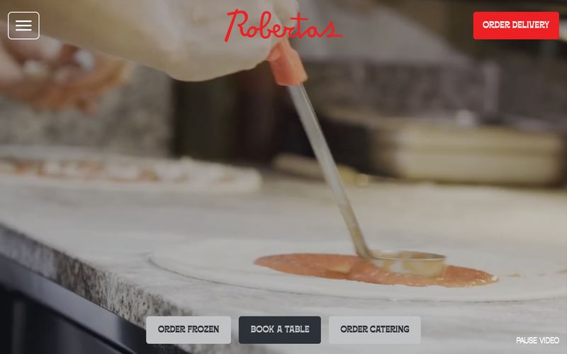
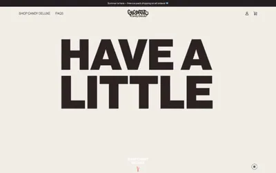
Roberta's runs on a near-monochromatic system anchored by white canvas and charcoal type, with vivid red deployed as a single loud punctuation color for primary actions, social-proof walls, and signature brand moments. The type system pairs a quirky tracked-out sans (Offset TM) for body, UI labels, and most controls with a condensed display face (Borensa) that takes over at 80–120px for headlines that shout from full-bleed sections. Layouts are unapologetically full-bleed: a video hero, a red 'Get Social' wall, a centered text-and-CTA stack — with content rhythm set by generous vertical breathing room and a decorative vocabulary of checkered borders, star bands, polaroid frames, and hand-drawn skull and pizza-slice iconography borrowed from Italian-American diner signage and zine culture. Buttons sit flat without elevation on the filled state; the only shadow in the system is a hard, 4px-offset drop on secondary links, deliberately retro rather than soft-modern.