# Bun — Style Reference
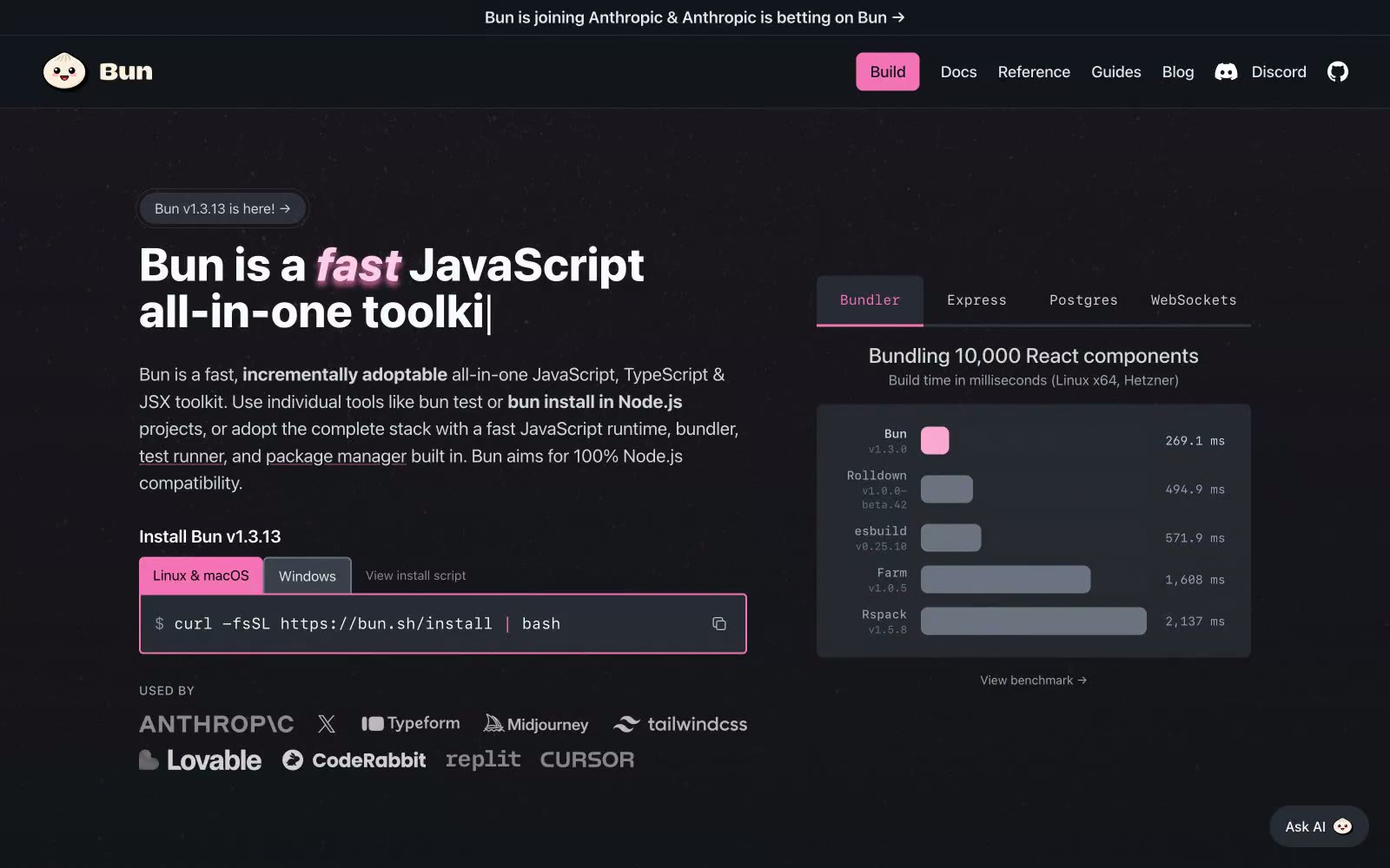
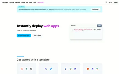
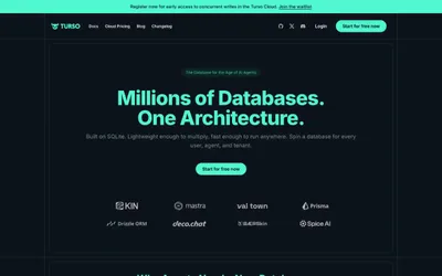
> Hot pink cursor in a midnight terminal — every interface element is either prose or code, and the pink tells you what to click.

**Theme:** dark

Source measurements are normalized; roles and recommendations are interpreted. Font summary lists are independent, not paired by position. HTML examples are reconstructions, not source components.

Bun's design language is a dark, developer-first aesthetic that treats the terminal as a design surface. The interface lives in near-black depths (#0d0e11) with elevated cards floating at #14151a and #1e2028, creating subtle depth without shadows. A single hot pink accent (#f472b6) cuts through the monochrome like a syntax highlighter cursor — it marks every primary action, highlights the fast word in headlines, and outlines code blocks, making interactive elements instantly scannable against the quiet background. Typography is utilitarian: system-ui for everything readable, JetBrains Mono for everything executable. Headlines are large and tight-tracked, body copy is generous and unembellished, and the visual rhythm alternates between prose sections and terminal-style code blocks. The overall feel is developer-tool meets brutalist poster — confident, slightly irreverent, and obsessed with speed.