# Good Glyphs — Style Reference
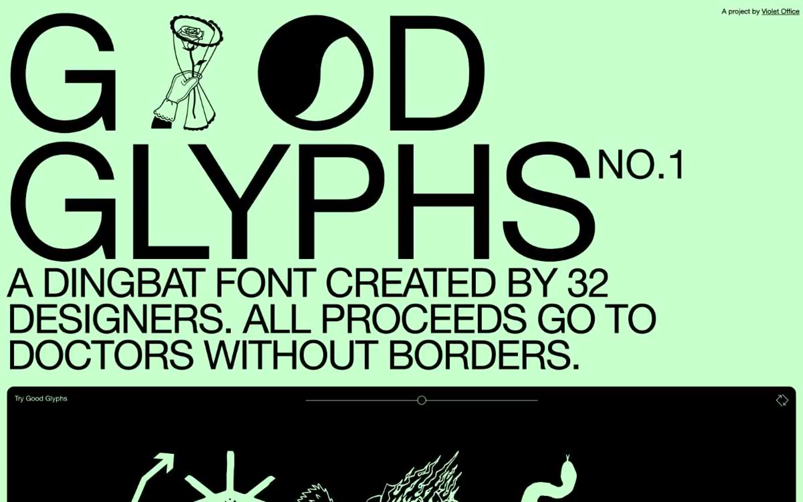
> oversized charity poster on mint paper — type so large it behaves as architecture, not text.

**Theme:** light

Source measurements are normalized; roles and recommendations are interpreted. Font summary lists are independent, not paired by position. HTML examples are reconstructions, not source components.

Good Glyphs treats the whole page as a printed charity poster: one mint-green canvas, one black ink, and type so large it functions as architecture rather than text. The system is anti-UI — there are no neutral grays, no semantic colors, no shadows, no gradients. A single soft celadon green (#c7ffcd) carries the entire chromatic load while pure black handles every stroke, border, label, and filled element. The signature move is the 288px display: the brand name itself becomes a graphic object, set tight with negative tracking so the letterforms lock into a wall of ink. Surfaces alternate between full-bleed mint and full-bleed black bands, producing a poster-strip rhythm rather than card-based hierarchy. Everything is built on a 4px base unit with tight 7–14px paddings; the only radii are 14px (soft cards) and a fully pill-shaped 140px for all interactive controls. Components feel stamped rather than designed: borders are always solid 1px black, text is always 13–14px, and the only moment of color contrast is white-on-black glyph artwork inside the dark showcase band.