# BEHAVE Candy — Style Reference
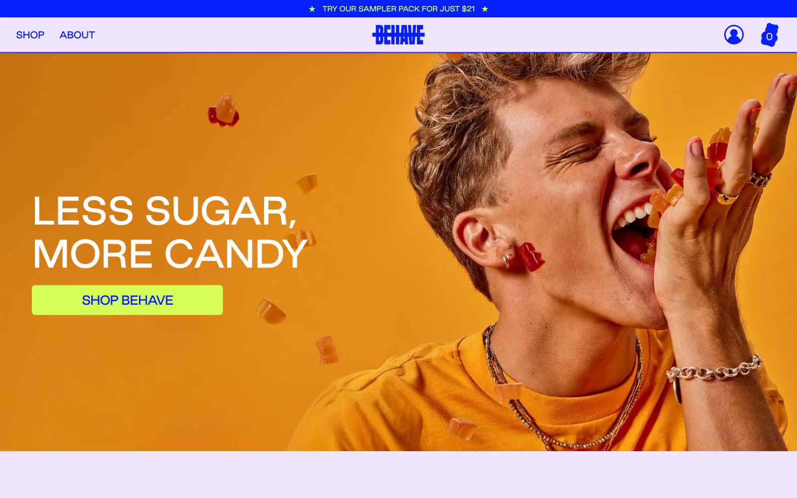
> neon candy-aisle pop. A single electric cobalt carries every word, chartreuse lime stabs through as the only accent, and pale lavender makes the whole thing feel lit from within rather than printed.

**Theme:** light

Source measurements are normalized; roles and recommendations are interpreted. Font summary lists are independent, not paired by position. HTML examples are reconstructions, not source components.

BEHAVE candy speaks in a maximalist candy-aisle visual language: a single dominant cobalt blue carries every word, border, and icon, while electric chartreuse lime punctuates only the moments that need to act or shout. The canvas is pale lavender rather than white, which makes the cobalt feel like neon signage rather than corporate navy. Photography is editorial and full-bleed — close-cropped people mid-bite, rows of gummy bears — and text is almost entirely the brand blue, never black or gray. Components are soft-cornered but not pillowy: cards carry a 20px radius and thin cobalt outlines, buttons sit at a tighter 7px radius, and type runs tight (-0.05em at display sizes) to give the wide headlines a compressed, almost squished punch. The overall feeling is unapologetically loud, friendly, and slightly bratty — built for a single product category, not a platform.