# Sneak in Peace — Style Reference
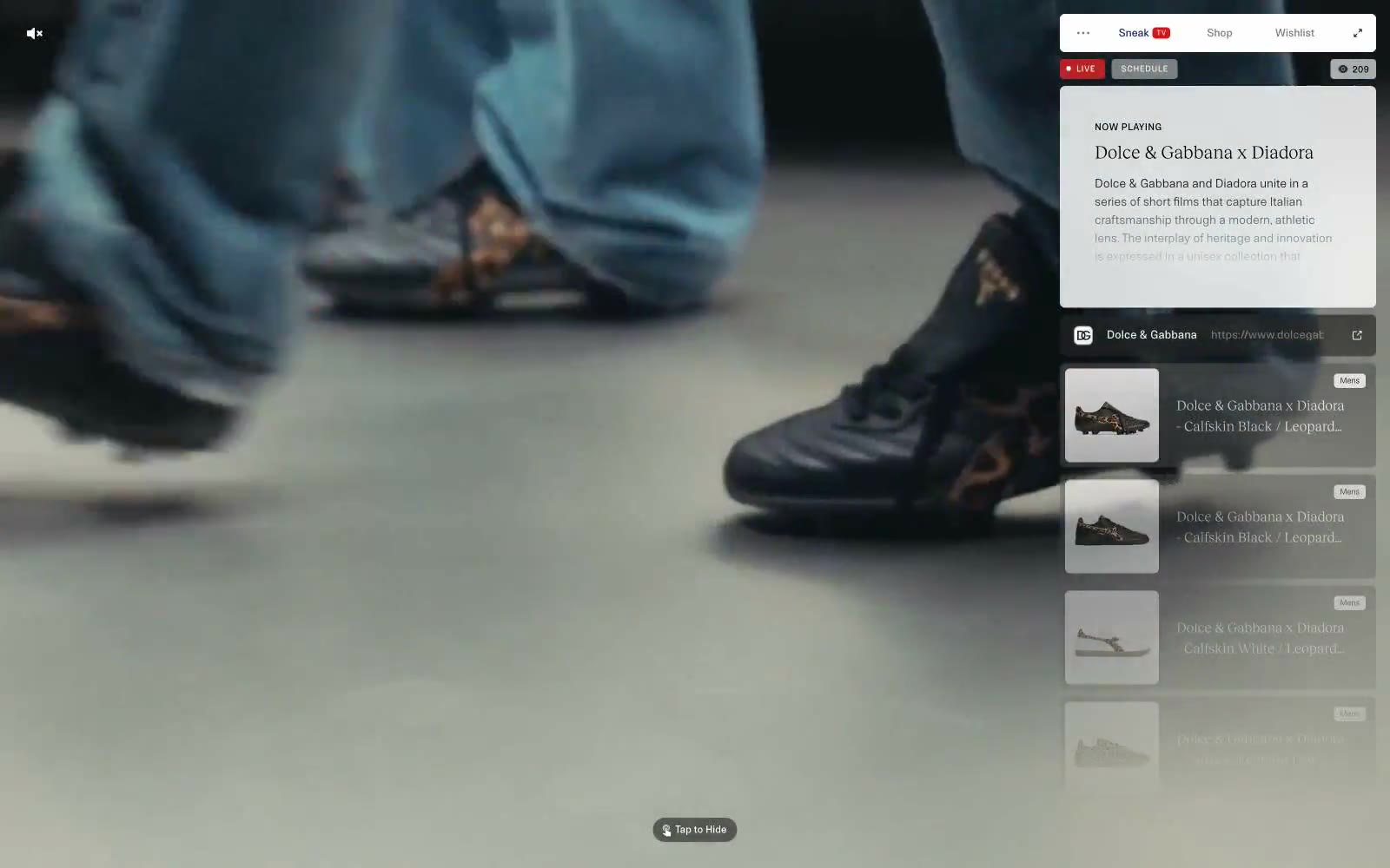
> Editorial gallery behind frosted glass. A single muted fashion film bleeds edge-to-edge while every interactive surface — tabs, now-playing card, product tiles — hovers in a translucent white panel pinned to the right edge, as if pinned to a museum vitrine.

**Theme:** light

Source measurements are normalized; roles and recommendations are interpreted. Font summary lists are independent, not paired by position. HTML examples are reconstructions, not source components.

Sneak in Peace operates as a floating editorial vitrine: a full-bleed fashion film runs behind a translucent white panel that carries every interactive surface. The system is aggressively monochrome — 99% of pixels live in a narrow band between white, warm off-white, and two workhorse grays (#3d3d3d and #000000). Color is rationed like ink: one vivid red reserved exclusively for live-status punctuation, one deep navy (#142161) that surfaces only as a link border, and nothing else. Typography splits sharply between a utilitarian grotesque (NTNeuss) at 8–14px with generous tracking — creating a label/UI vocabulary — and a single editorial serif (RecklessNeue) used at 16–21px for narrative titles. Components are compact, 6px-cornered, almost flat, and float over the media rather than block it. The dominant gesture is restraint: the camera does the talking, the UI whispers.