# UGLYCASH — Style Reference
> Sticker-covered notebook on cream paper — a vibe of irreverent, maximalist fintech that wears its chaos proudly.

**Theme:** light

Source measurements are normalized; roles and recommendations are interpreted. Font summary lists are independent, not paired by position. HTML examples are reconstructions, not source components.

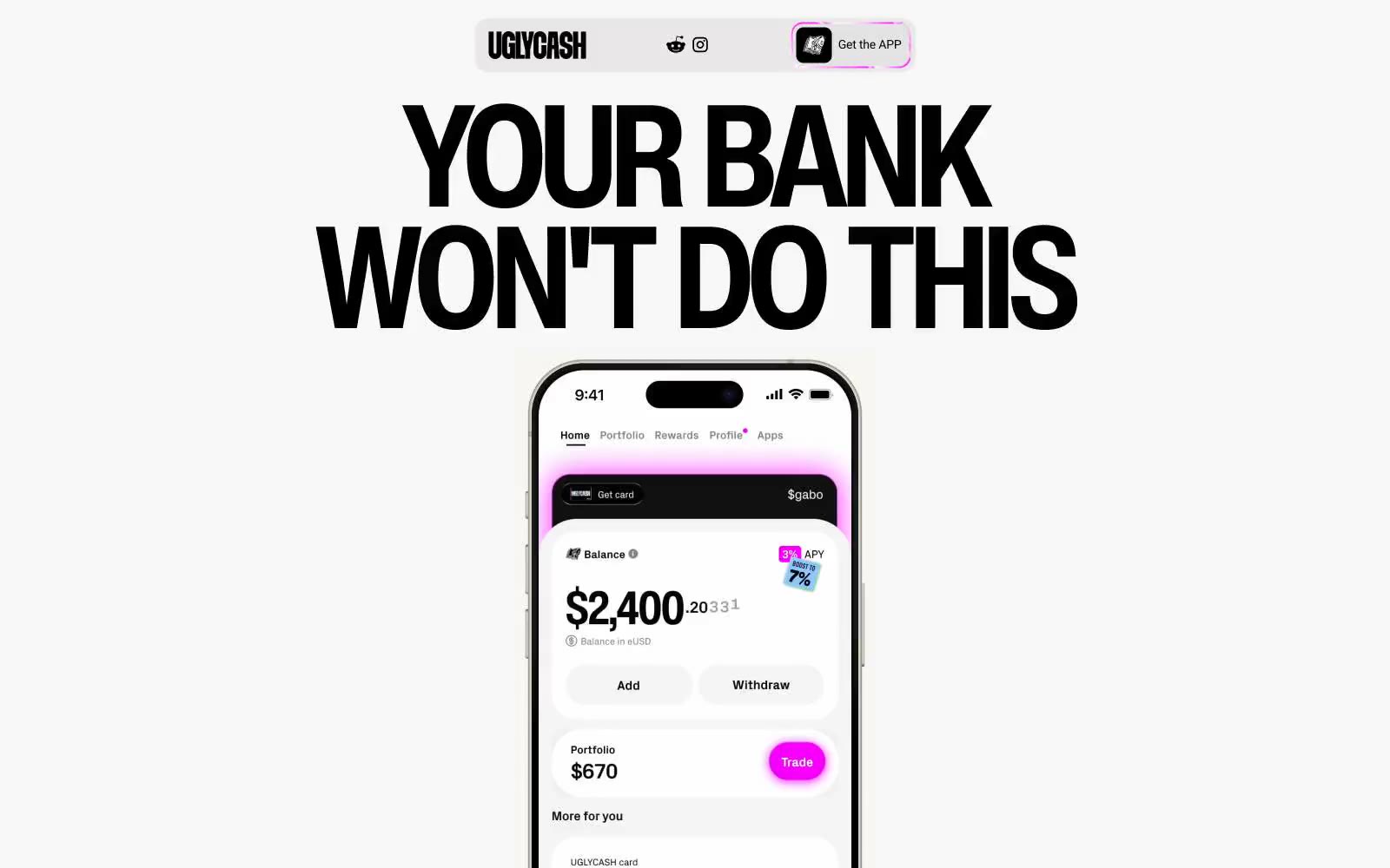
UGLYCASH runs a sticker-bombed Gen-Z finance language: warm light canvas, oversized black display type, and a riot of vivid accent panels (hot pink, electric cyan, toxic lime, dusty khaki) splashed across mostly achromatic layouts. The signature move is a heavy black hairline (1px) that traces every surface — cards, phone frames, buttons, illustrations — giving the impression of printed stickers peeled onto a page. Radii are exaggerated (16px for controls, 38–46px for hero cards) to amplify the soft, toy-like feel, while the palette stays disciplined: one neutral canvas, one neutral surface, and three or four saturated brand colors used as full-bleed card fills rather than thin accents. Headlines shout at 85–164px with negative tracking; body text retreats to 14–18px Inter. Everything reads as fast, loud, and deliberately unpolished.