# Dries Bos — Style Reference
> editorial ink on warm vellum

**Theme:** light

Source measurements are normalized; roles and recommendations are interpreted. Font summary lists are independent, not paired by position. HTML examples are reconstructions, not source components.

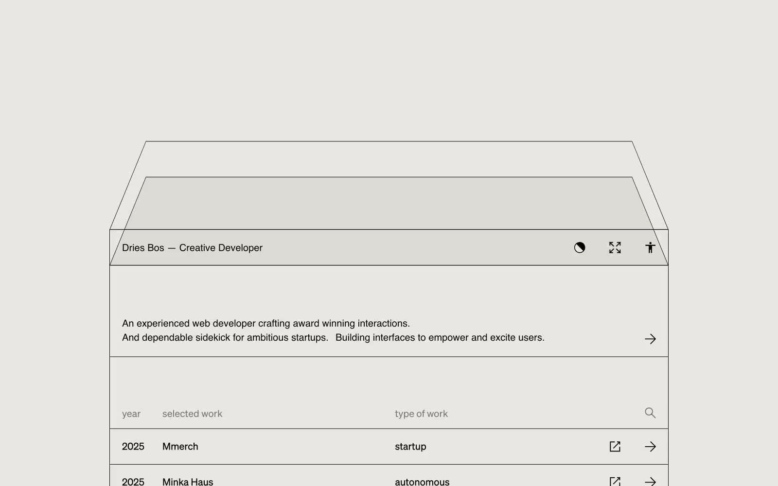
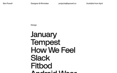
A monochromatic portfolio language built on warm vellum paper and near-black ink — the visual equivalent of an architect's drafting table. Every element is a line, a label, or empty space; no fills, no shadows, no chromatic accents interrupt the editorial calm. The work list is a spreadsheet made beautiful: columns, dates, project names, and discipline tags sit on the same horizontal grid, separated by hairline rules rather than card containers. The hero is a large wireframe drawing — thin strokes on warm ground — that signals the developer's craft without ever showing a screenshot. Color is structural (paper, ink, gray) not expressive; the site trusts whitespace and type to carry mood.