# Bpowell — Style Reference
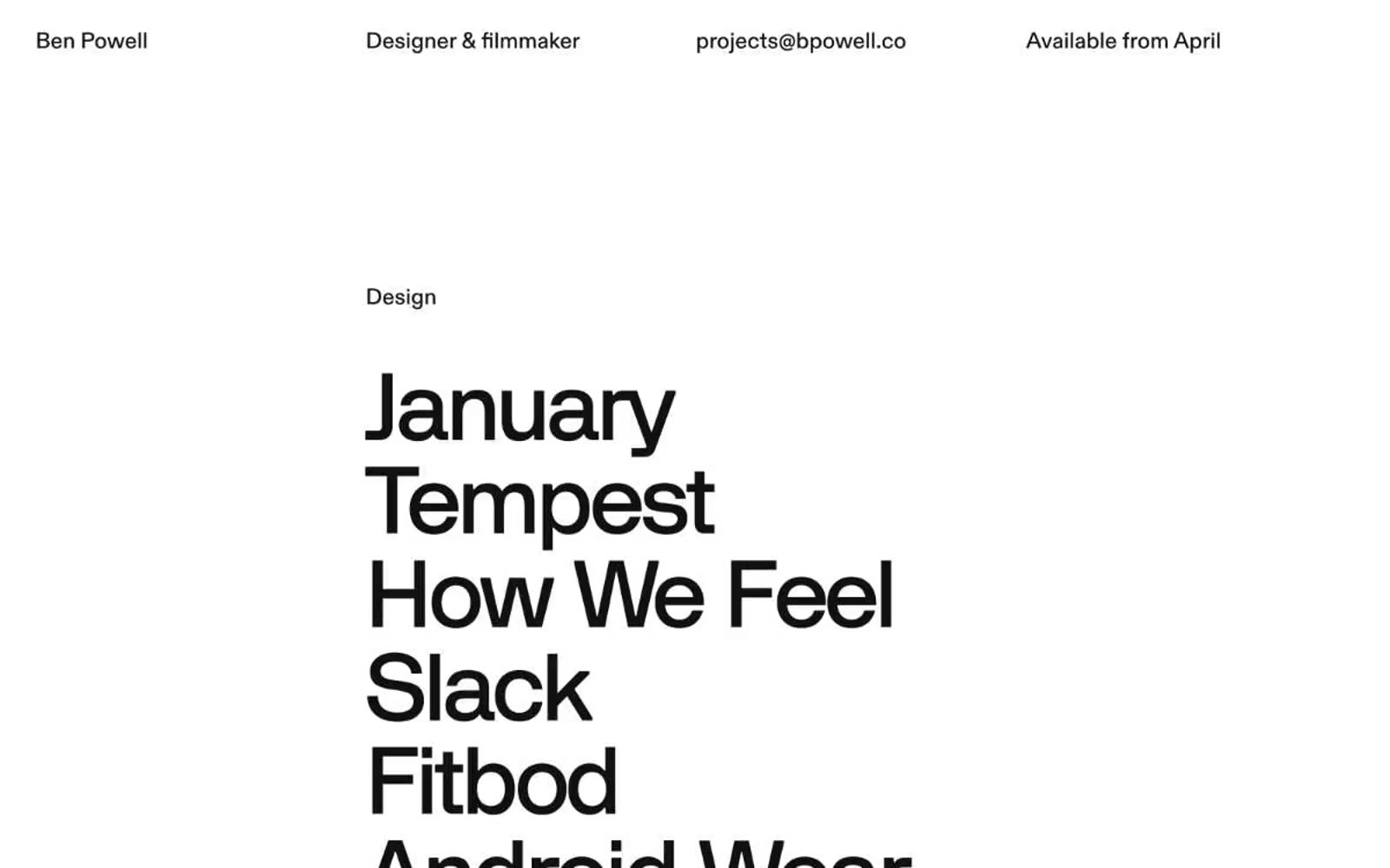
> type as architecture on white plaster

**Theme:** mixed

Source measurements are normalized; roles and recommendations are interpreted. Font summary lists are independent, not paired by position. HTML examples are reconstructions, not source components.

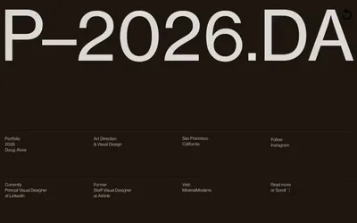
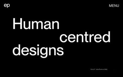
A text-only portfolio that lets typography do every job — no imagery, no decoration, no chrome. The page reads as an architectural list: small tightly-set labels act as section markers, then oversized project names stack like concrete blocks on a wall. Two surfaces alternate — a bright white canvas for design work, an inverted near-black canvas for film — and the contrast between them is the only visual rhythm. The layout is brutally asymmetric: a single column of oversized text pinned to the left, generous gutters of negative space, and a top nav that distributes itself across the full viewport width rather than clustering in a corner. The system has no buttons, no cards, no borders in the traditional sense — the nearest thing to a border is a 1px black hairline, and even that is used sparingly. The result feels like reading a credits sequence printed on a gallery wall: austere, deliberate, and confident that the names themselves carry the weight.