# 19–86 — Style Reference
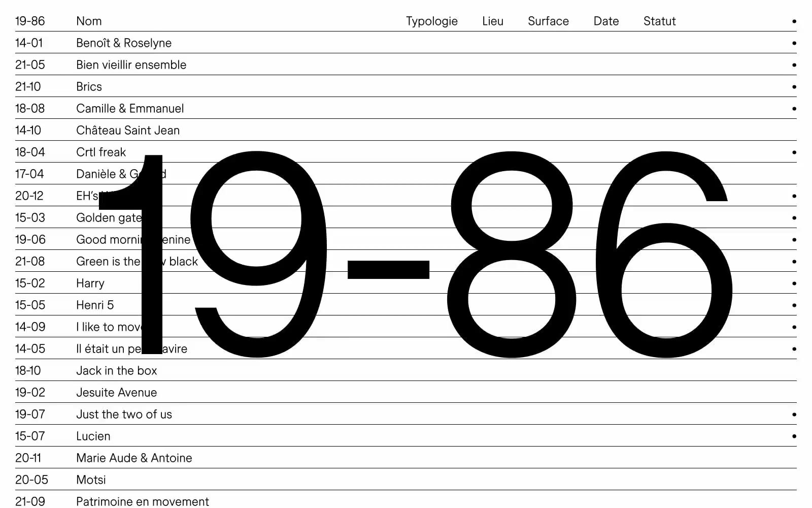
> Monumental numerals on white ledger

**Theme:** light

Source measurements are normalized; roles and recommendations are interpreted. Font summary lists are independent, not paired by position. HTML examples are reconstructions, not source components.

19–86 is a typographic ledger — a French design studio that compresses its entire visual identity into a single hairline weight of one custom typeface and the barest possible palette: black on white. The brand number itself, set at 490px, lives behind the content as a permanent architectural watermark, never louder than the project list it organizes. Information is presented as a flat, left-aligned index — date, title, typology, location, surface, status — separated by 1px rules, never by cards, shadows, or color. The 24px body and the 490px display are the same font, the same whisper weight; the difference is amplitude, not voice. White space is the primary design tool: 24px between rows, generous side margins, and the watermark breathing through the gaps. Every screen should feel like a page from a Swiss architecture manual — spare, certain, unsentimental, and confident that less is enough.