# Busuu — Style Reference
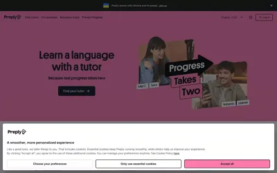
> playful passport of global connection. Vivid gradient skies, bubble greetings, and circular flags make the whole interface feel like a warm invitation to the world.

**Theme:** light

Source measurements are normalized; roles and recommendations are interpreted. Font summary lists are independent, not paired by position. HTML examples are reconstructions, not source components.

Busuu's design system radiates warm, approachable energy through a vivid purple-to-blue gradient hero that bleeds confidence before settling into a calm, near-white workspace. The dominant interface is built on a very pale blue-tinted canvas (#f2f7fd) with white cards floating above it, and a single saturated spring-green (#11ee92) acts as the primary action accent — an unconventional choice that immediately distinguishes it from the sea of blue CTAs in edtech. Typography is custom (Nista) with a compact, bold-friendly weight stack: heavy 800 for display, 700 for headings, and a clean 400 for body, giving the system a confident, slightly geometric voice. The visual language is heavily illustrated — flat, colorful character art with circular framing devices — and the layout relies on generous padding, pill-shaped controls, and circular flag tiles to make global language learning feel tactile and inviting rather than academic.