# Flying Papers — Style Reference
> Saturday morning cartoon confessional

**Theme:** light

Source measurements are normalized; roles and recommendations are interpreted. Font summary lists are independent, not paired by position. HTML examples are reconstructions, not source components.

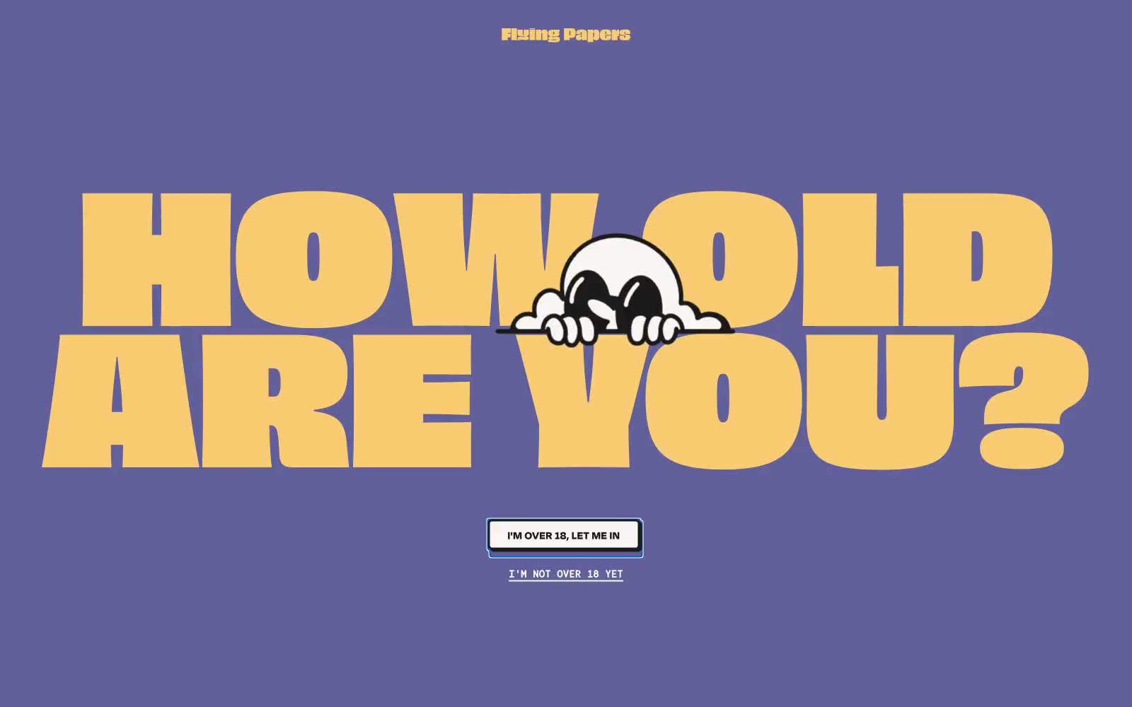
Flying Papers operates like a Saturday-morning cartoon printed on thick riso cardstock: a flat muted-violet stage, a small cast of saturated confetti colors, and type so oversized it eats the viewport. The brand voice is loud, cheeky, and unrepentant — it doesn't ask for attention, it takes it. Every screen should feel like a single bold poster: one dominant display headline, one supporting character illustration, one inline action, and generous breathing room. Borders do the heavy lifting instead of shadows; color is used as paint, not data. Surfaces stay flat, edges stay sharp at 6px, and the only soft thing in the system is the 100px pill on the gate button.