# Kit — Style Reference
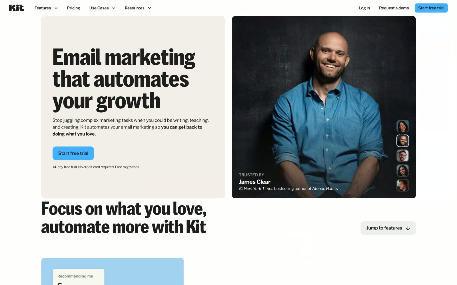
> Warm creator notebook — parchment pages, highlighter-blue ink, heavy type on linen.

**Theme:** light

Source measurements are normalized; roles and recommendations are interpreted. Font summary lists are independent, not paired by position. HTML examples are reconstructions, not source components.

Kit reads like a warm editorial notebook — cream-tinted parchment (#f2efe9) as the page base, heavy black headlines punching out of it at weight 700, and a single sky-blue accent (#44b1ff) that appears on CTAs and interactive highlights against the near-black (#1e1e1e). The palette is intentionally muted and hand-curated: soft pastel blocks (dusty blue, blush pink, peach, sage green) appear as section backgrounds, never as text or interaction states, making the one vivid blue feel like a highlighter on a notebook page. KitSansFont at 80px/64px in the custom weight 500 dominates hero spaces with tight -0.009em tracking, while Libre Franklin handles everything else across the content hierarchy — a two-font system where custom display and workhorse utility stay in clearly assigned lanes. Radius tokens are tight and intentional: 12px on buttons and cards, 8px on secondary UI, creating a slightly-rounded-but-serious personality that avoids both sharp corporate rigidity and bubbly consumer softness.