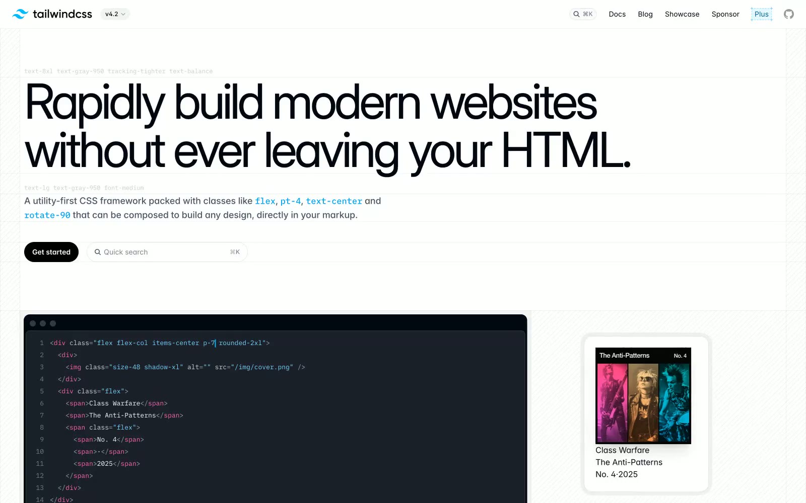
# Tailwind CSS — Style Reference
> Type specimen as product demo — a typographer's proof sheet where the headline IS the interface, bold black at 96px demanding attention through size alone.

**Theme:** light

Source measurements are normalized; roles and recommendations are interpreted. Font summary lists are independent, not paired by position. HTML examples are reconstructions, not source components.

Tailwind CSS's homepage feels like a live code editor bleeding into a marketing page — black type hammered at near-display scale, monospace code fragments interrupting prose, and a white canvas that never apologizes for its blankness. The near-black #030712 dominates everything: headings, body copy, borders, and buttons all collapse toward the same ink-black anchor, creating a stark tonal discipline rarely seen on developer tools sites that usually reach for blue. The signature move is scale contrast: 96px Inter at weight 700 next to 14px monospace code, the size gulf doing all the visual work that color usually handles. Accent colors (sky blue #00a6f4, hot pink #e60076) appear exclusively inside inline code snippets as syntax highlights, never as UI chrome — they're content, not decoration. The color palette swatch section generates a systematic rainbow of every Tailwind hue, but the actual UI uses only ink-black, white, and near-grays.