# Busy Bee Honey — Style Reference
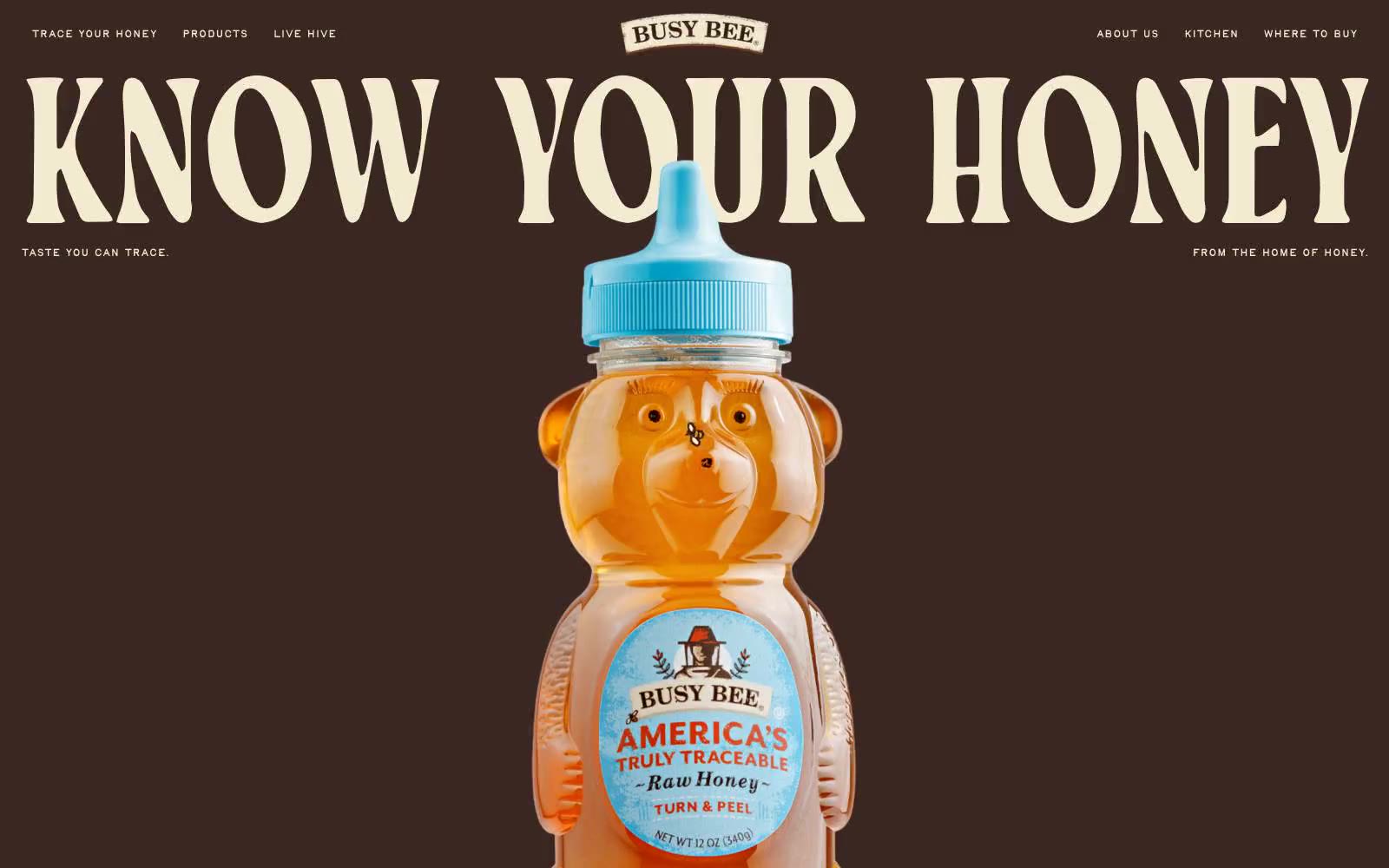
> painted barn-side honey label — dark cocoa, gold, and blue stacked like a vintage billboard. Two sentence grounding: massive condensed serif display type bleeds edge-to-edge against solid color bands, and the bear-bottle product sits centered and unframed like the hero of a roadside sign.

**Theme:** mixed

Source measurements are normalized; roles and recommendations are interpreted. Font summary lists are independent, not paired by position. HTML examples are reconstructions, not source components.

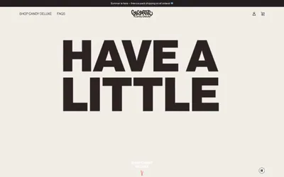
Busy Bee Honey speaks in a roadside-Americana voice: full-bleed bands of dark cocoa, honeycomb gold, and cornflower blue, each separated by a scrolling marquee strip. Display headlines are enormous — up to 238px — in a condensed display serif with aggressive 0.80 line-height and slight negative tracking, so words like 'KNOW YOUR HONEY' loom like painted barn-side lettering. The product (the bear-shaped bottle) is the visual anchor: centered, unframed, full-bleed, no card chrome around it. Color blocks are flat, unshadowed, and contiguous — the design relies on brutal color contrast and type scale to create rhythm, not on elevation or container surfaces. Pills are the only shape language; everything else is rectangular and sectioned. The feel is less 'ecommerce product page' and more 'printed honey label folded into a billboard'.