# wix.com — Style Reference
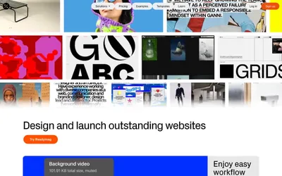
> Daylight gallery wall with electric blue signposts

**Theme:** light

Source measurements are normalized; roles and recommendations are interpreted. Font summary lists are independent, not paired by position. HTML examples are reconstructions, not source components.

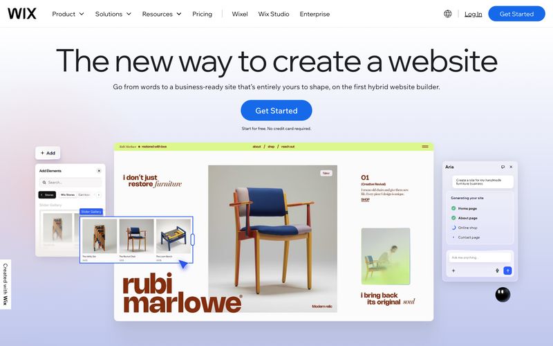
Wix's visual system reads as a spacious, air-filled workspace on a bright white canvas, where oversized headlines in the custom Madefor Display typeface set a confident but airy tone. The palette is overwhelmingly achromatic — black text, white surfaces, hairline gray borders — with a single saturated electric blue (#166aea) reserved for primary action buttons and a secondary black-filled pill as the alternative action. Color appears as intentional punctuation: a lime-green surface wash, a soft lavender gradient, a yellow highlight, a violet accent — each used sparingly to mark sections, not to decorate. Components are flat, rounded, and lightweight: pill buttons at 50px radius, cards at 20px, images at 8.9px, minimal shadows. The grid breathes — generous section gaps near 80px, centered hero compositions, alternating product mockups that feel like editorial spreads rather than SaaS screenshots.