# Mr. Pops — Style Reference
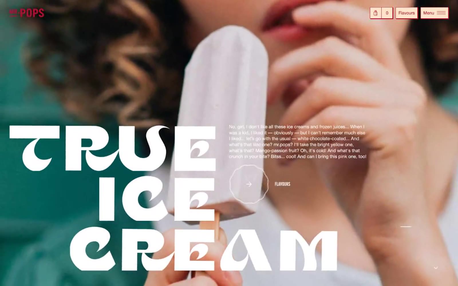
> retro ice cream parlor on cream paper. A bright white shopfront with cherry-red trim, stacked marquee letters, and warm cream cards beneath full-bleed food photography.

**Theme:** light

Source measurements are normalized; roles and recommendations are interpreted. Font summary lists are independent, not paired by position. HTML examples are reconstructions, not source components.

Mr. Pops reads like a sunlit ice cream parlor printed on cream cardstock: warm white canvas, massive condensed display type set tight over full-bleed lifestyle photography, and a single cherry-red used almost exclusively as outline and stroke. The dominant gesture is bold — Cervo display hits 144px with 0.75 line-height and 0.05em positive tracking, stacked four lines deep — but the chrome stays airy: thin red borders, pill buttons, 40px corners, and cream-tinted secondary surfaces instead of gray. Neutrals (black, white, warm cream) carry the structure while the red punctuates. Components should feel like a hand-stamped menu card: generous whitespace, confident borders, no drop shadows, and photography that bleeds to the edge of the screen.