# Monotype. — Style Reference
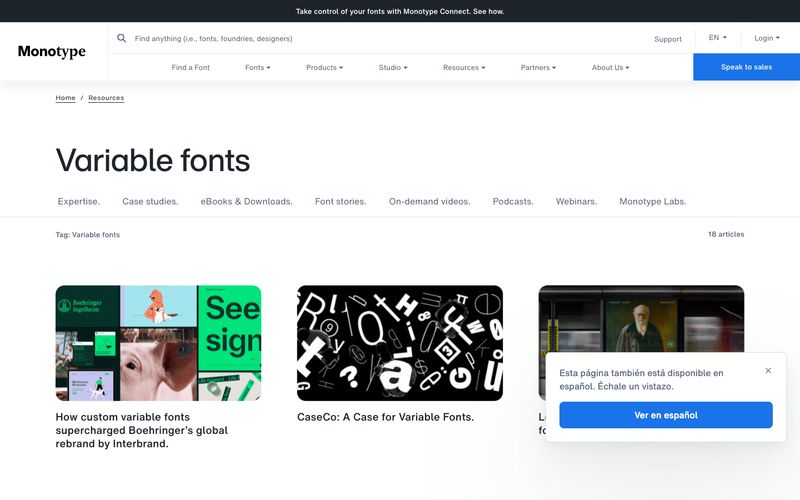
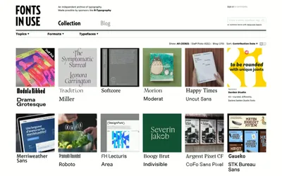
> Curated typography showcase on paper. Monotype's interface behaves like a gallery wall: white surfaces, hairline dividers, generous whitespace, and type itself as the only ornament.

**Theme:** light

Source measurements are normalized; roles and recommendations are interpreted. Font summary lists are independent, not paired by position. HTML examples are reconstructions, not source components.

Monotype's design is an editorial type museum on white: the type is the artifact, the chrome recedes. The interface is overwhelmingly monochrome — near-black ink (#1e242c) on paper-white, with hairline gray dividers and a single saturated blue reserved exclusively for conversion. Components are low-elevation and flat: thin 1px borders instead of shadows, modest 8px radii on controls, generous 16-24px internal padding. Typography is the hero: a custom HelveticaNow family handles body, nav, and display, with a -0.02em tracking on bold labels that signals the brand's typographic pedigree. Layout breathes — comfortable 8px base grid, 16px element gaps, wide section spacing — letting featured type specimens and photography carry visual weight without competition from the UI.