# Vivid Spain — Style Reference
> Lavender dusk over white marble — a soft violet wash on a clean white surface, where one vivid purple accent does all the work.

**Theme:** light

Source measurements are normalized; roles and recommendations are interpreted. Font summary lists are independent, not paired by position. HTML examples are reconstructions, not source components.

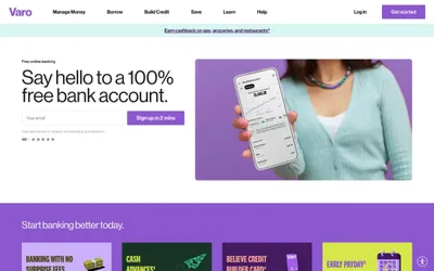
Vivid is a lavender-lit fintech canvas: a white marble surface washed in soft violet gradients, where the only chromatic decision a designer makes is how much purple to pour on. The system is radically monochromatic — a single vivid violet (#7d33f6) carries every interactive moment, from logo to CTA to active toggle, while the rest of the interface stays in a disciplined gray-on-white scale. Components breathe through soft pastel card backgrounds (#f4edff, #e9d4fb) and pill-shaped controls (100px radius) that feel like rounded candy, never corporate. Typography is geometric Satoshi at every weight, with aggressive negative letter-spacing on display sizes pulling the headlines tight, and generous positive tracking on small uppercase labels. The visual signature is restraint: no shadows, no borders on hero surfaces, no decorative noise — just purple light, white space, and confident type.