# Typewolf — Style Reference
> Warm parchment typography atelier. Every element is a brownish-ink stamp on dusty rose paper, with no color allowed to compete with the type.

**Theme:** light

Source measurements are normalized; roles and recommendations are interpreted. Font summary lists are independent, not paired by position. HTML examples are reconstructions, not source components.

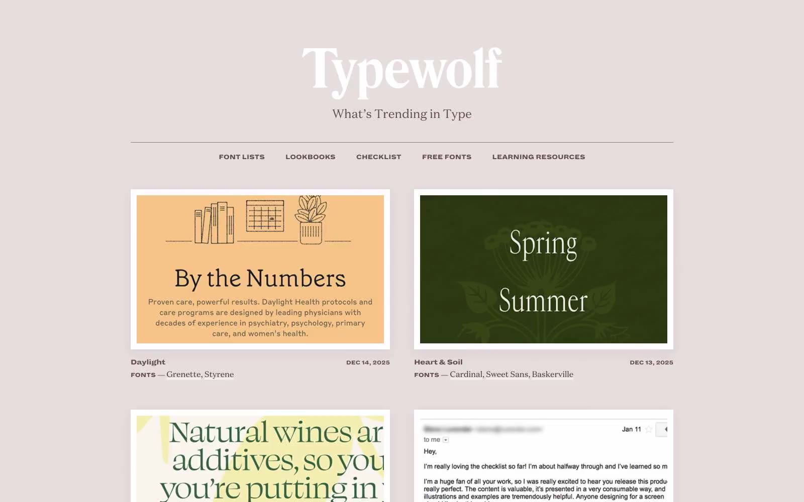
Typewolf reads as a warm, editorial type specimen magazine pressed into a website: a dusty rose canvas (#f8f5f5) supports white rectangular cards in a two-column grid, all anchored by brownish-ink text rather than any chromatic accent system. The palette is deliberately near-monochromatic — a dark warm brown (#443235) for body copy and headlines, a slightly lighter brown (#654a4e) for nav and secondary links, and a single muted dusty rose (#916a70) reserved for borders and quiet emphasis. Typography carries the entire identity: a transitional serif (Domaine Text) for body, an ultra-heavy condensed sans (Dia) for ALL-CAPS micro-labels with -0.03em tracking, and a high-contrast display serif (Domaine Display Narrow) for editorial headlines. Surfaces are sharp-cornered, elevated only by a warm-tinted diffuse shadow (rgba(145,106,112,0.15) 0 6px 24px) that ties the elevation back to the brand palette. The result is a site that feels more like a printed specimen catalog than a web product — restrained, content-first, and quietly opinionated.