# Uber — Style Reference
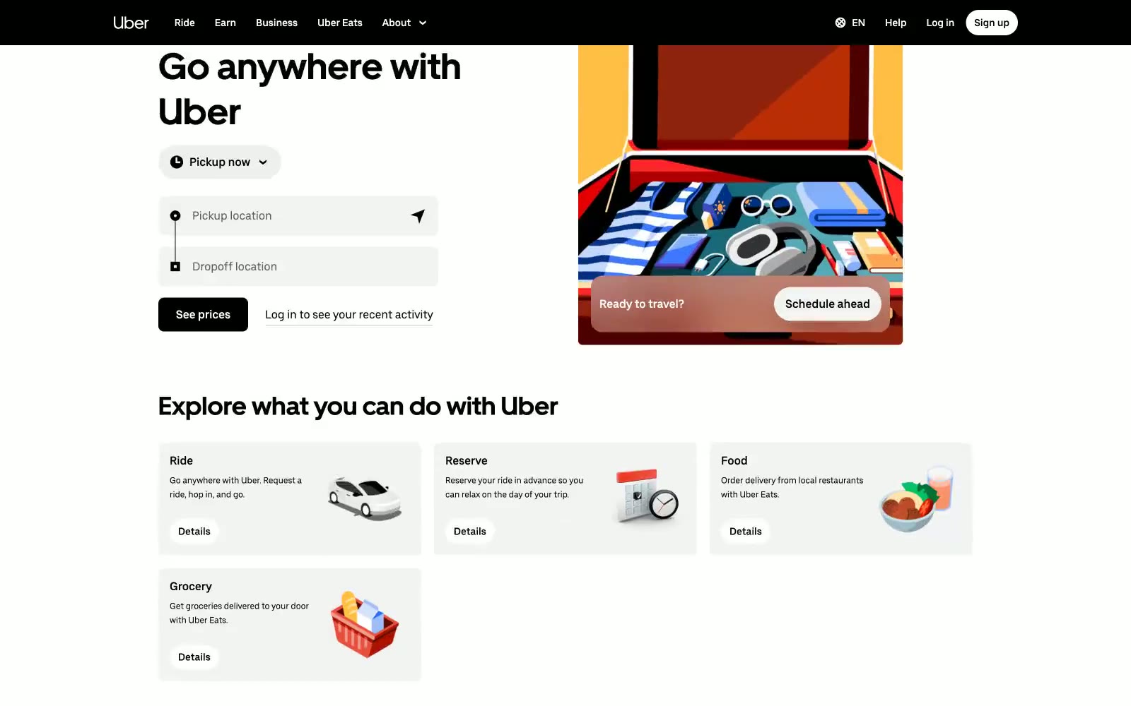
> Black-and-white transit kiosk. Picture a monochrome wayfinding panel where the only color comes from editorial illustrations mounted beside the input form.

**Theme:** light

Source measurements are normalized; roles and recommendations are interpreted. Font summary lists are independent, not paired by position. HTML examples are reconstructions, not source components.

Uber's interface is a disciplined black-on-white transit kiosk: every screen is a white canvas anchored by a single black navigation bar, a black footer, and solid black controls, with zero chromatic UI color. All color in the system lives inside flat editorial illustrations — a packed suitcase, two riders in a car, a bowl of food — that float beside the form rather than within it. Typography is custom and confident: UberMove at 52px for headlines with tight 1.22 line-height, UberMoveText at 14–18px for everything else, and a single weight (400) does the work that other systems spread across three. Components are flat, borders are 1px hairline grays, and radii are binary — 8px for cards, inputs, and standard buttons, or a full 999px pill for nav CTAs and toggles. The only structural rhythm break is the sticky black 'See prices' bar that follows scroll, a persistent commitment to the next conversion.