# Studio Few — Style Reference
> monochrome letterform sanctuary — a white gallery where black ink is the only ornament

**Theme:** light

Source measurements are normalized; roles and recommendations are interpreted. Font summary lists are independent, not paired by position. HTML examples are reconstructions, not source components.

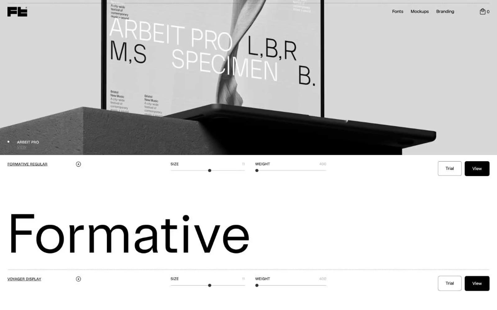
Studio Few is a type foundry where the product is the alphabet, so the design recedes entirely. The interface is pure achromatic: white canvas, black ink, a single mid-gray for inactive controls, and almost no decorative chrome. Every screen is a vertical sequence of full-width specimen rows — a tiny label, two thin slider tracks for size and weight, an outlined Trial button, a solid black View button, and then enormous custom type rendered at 115–158px as the hero. The custom Sterling family carries all UI text at 12–14px, while the specimen displays use the foundry's own faces (Formative, Voyager, Anthro, Blok, ArbeitPro, Apex), each shown solo with no surrounding art. The result feels like a gallery wall: the only thing with visual weight is the letterform itself.