# Nike.com — Style Reference
> monochrome gallery of athletic performance — white walls, product as art, chrome dissolved into the background.

**Theme:** mixed

Source measurements are normalized; roles and recommendations are interpreted. Font summary lists are independent, not paired by position. HTML examples are reconstructions, not source components.

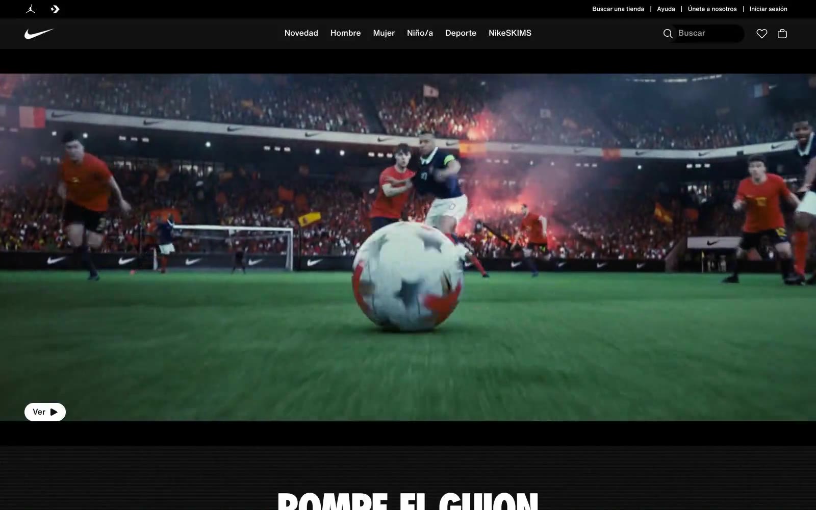
Nike.com operates as a product-first monochrome gallery: the UI stays nearly invisible so product photography can carry every screen. The entire interface is built from black, white, and three tints of gray — no accent color, no decorative gradient, no warm brand chrome. The Nike identity lives in the swoosh and the photography, never in the UI itself. Typography is compact and utilitarian, leaning on a custom Helvetica Now family at 12-20px with one oversized Nike Futura ND moment at 76px for hero headlines. Components are minimal: pill-shaped buttons at 30px radius, flat product cards, hairline borders, and almost zero elevation. The page alternates between pure white product surfaces and dramatic full-bleed dark editorial hero sections, creating rhythm through contrast rather than ornament.